Introduction to Pixel Art for Games
Ever wanted to create awesome 2D pixel art for your mobile games? This tutorial walks you through the process of building simple yet powerful pixel art characters. Includes best practices, insider tips, and step-by-step instructions to create a simple but powerful retro character for your game. By .
Sign up/Sign in
With a free Kodeco account you can download source code, track your progress, bookmark, personalise your learner profile and more!
Create accountAlready a member of Kodeco? Sign in
Sign up/Sign in
With a free Kodeco account you can download source code, track your progress, bookmark, personalise your learner profile and more!
Create accountAlready a member of Kodeco? Sign in
Contents
Applying Color and Shading
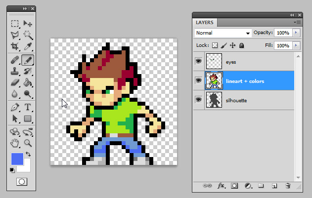
Now you’re ready to start coloring your character. Don’t bother choosing the right colors now — it’s very easy to change them later. Just make sure that everything has its own color. For now, you can use the default colors from the Swatch tab by selecting Window ▸ Swatches.
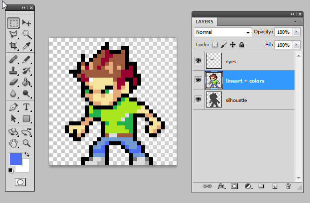
Go ahead and color your hero like this — but feel free to be creative and use your own colors!
Good color contrast makes a better readibility of your asset!
Notice that I didn’t outline the clothes or hair. Always remember: save as many pixels as you can!
Oh, and don’t waste time by carefully placing each color pixel. To speed things up, draw the lines for each color and use the Paint Bucket tool to fill the spaces. You’ll need to configure this tool too. Select it on the tool bar, or just press G. Change the Tolerance to 0 and uncheck anti-alias.
Tip: If you ever need to use the Magic Wand tool, a very useful tool that selects all pixels with the same color, apply the same settings as for the Paint Bucket — no tolerance or anti-alias.
Tip: If you ever need to use the Magic Wand tool, a very useful tool that selects all pixels with the same color, apply the same settings as for the Paint Bucket — no tolerance or anti-alias.
Adding Highlights and Shading
The next step will require you some basic light and shading knowledge. If you don’t know too much about it, here’s a quick guide for it, and a more complete one here. If you don’t feel like learning this right now, you can skip this step and go toward to “Spicing Up Your Palette”. Shading, after all, is a matter of style. Choose what feels right for your game and capability.
Or, you can simply make your shading similar to my example below!
Use the same light source for the whole asset
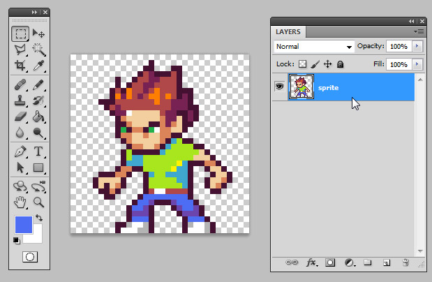
Try to give as much shape as you can; this is where the asset begins to look richer. For instance, you can now see a nose, a frowning expression in the eyes, hair volume, and folds in his pants. Adding a few light spots will make the character look even better:
Keep the same light source you used for the shading
Spicing Up Your Palette
Photoshop has a great range of colors on its standard palette, but don’t rely too much on it. Since so many people use the default palette colors, they look the same across many games. It’s best to make your own colors by clicking the main palette at the bottom of the tool bar.
Then, in the Color Picker window, browse through the right sidebar to choose a color. Next, in the main area, choose its brightness (more white or more black) and saturation (duller or more vivid).
Once you choose your color, click OK and reconfigure the Paint Bucket tool. Don’t panic, you just need to uncheck the Contiguous box so that when you paint the new color, every pixel with the same color in the layer will be painted, too.
Uncheck the Contiguous box to paint all pixels from the same color
This is another reason why it’s important to keep the color count low and to always use the same color when dealing with the same element — shirt, hair, helmet, armor and so on. But don’t forget to use a different color for other areas. Otherwise, they’ll be recolored, too!
Change the colors as much as you want and make your character look great. You can even recolor the outline, just make sure it blends correctly with the background.
Finally, you’ll make a background color test. To do this, make a new layer underneath your character and fill it with various colors. It’s really important to make sure your character will be visible on light, dark, warm and cool backgrounds.
Tips on Editing Pixels in Photoshop
As you can see, I turned off the anti-alias on all of the tools I’ve used so far. Don’t forget to turn it off on others tools as well, such as the Elliptical marquee and Lasso tool.
It could come in handy to resize a little bit some parts or even rotate them to animate further frames, like running cycles. To do so, use any marquee tool (press M) to select an area. Then right-click it and choose Free Transform, or simply press Ctrl-T. You’ll be able to resize and rotate your character freely.
However, Photoshop automatically anti-aliases everything edited with the Free Transform function. Before confirming your edit, go to Edit ▸ Preferences ▸ General or Ctrl-K, and change Image Interpolation to Nearest Neighbor. In a nutshell, that calculates the new position and size very roughly, applying no new colors or transparency, preserving the colors you chose.
Integrating Pixel Art Into an iPhone Game
Hi everyone, it’s Ray here, and I’m jumping into this tutorial at this point to show you how you can integrate the pixel art you just made into an iPhone game using the Cocos2D game framework.
Create a new project with the iOS\cocos2d v2.x\cocos2d iOS template, name it PixelArt, and select iPhone for the device family.
Drag the final pixel art character you created into your project.
Then, open HelloWorldLayer.m and replace the init method with the following:
-(id) init
{
    if( (self=[super init])) {

        CCSprite * hero = [CCSprite spriteWithFile:@"sprite_final.png"];
        hero.position = ccp(96, 96);
        hero.flipX = YES;
        [self addChild:hero];

    }
    return self;
}
This positions the sprite to the left side of the screen and flips him so he’s looking to the right.
Compile and run, and you’ll see your sprite as expected on the screen:
However, remember we decided earlier in this tutorial that we wanted to scale up the art artificially big so the individual pixels are really visible, to give an extra-blocky cool pixel art feel.
So add this extra line inside init:
hero.scale = 2.0;
Easy, right? Compile and run and… wait a minute, the sprite is blurry!
This is because, by default, Cocos2D anti-aliases art when it scales it. For pixel art we don’t want that — we want to preserve the hard edges.
Luckily, this is quite easy to fix! Just add this extra line:
[hero.texture setAliasTexParameters];
This configures Cocos2D to scale the image without anti-aliasing, so it still looks “pixel-like.” Compile and run and w00t — it works!
Notice the advantage of using pixel art — we were able to use a smaller image size than what is actually displayed to the screen, saving a lot of texture memory. And we don’t even need to provide separate images for the retina display, as we want that blocky look!
That’s it for me — back to Glauber, who will wrap it up!


