Introduction to Pixel Art for Games
Ever wanted to create awesome 2D pixel art for your mobile games? This tutorial walks you through the process of building simple yet powerful pixel art characters. Includes best practices, insider tips, and step-by-step instructions to create a simple but powerful retro character for your game. By .
Sign up/Sign in
With a free Kodeco account you can download source code, track your progress, bookmark, personalise your learner profile and more!
Create accountAlready a member of Kodeco? Sign in
Sign up/Sign in
With a free Kodeco account you can download source code, track your progress, bookmark, personalise your learner profile and more!
Create accountAlready a member of Kodeco? Sign in
Contents
Pixel art is really popular in games these days, and for some great reasons:
- Looks: Pixel art looks awesome! There’s something to be said about making the most about each pixel in a sprite.
- Nostalgia: Pixel art brings back a great nostalgic feeling for gamers who grew up playing Nintendo, Super Nintendo or Genesis (like myself!).
- Ease of learning: Pixel art is one of the easiest types of digital art to learn, especially if you are a more of a programmer type than an artist. ;]
So wanna try your hand at some pixel art? Follow along with me and I’ll show you how to make a simple but cool game character you can use or tweak in your own games!
Learn pixel art by making this cool game character!
And as a bonus, after I show you how to make the character, Ray will dive in and show you how to integrate it into an iPhone game!
To follow along with this tutorial, you will need Adobe Photoshop. If you do not have Photoshop, you can download a free trial from Adobe.
Read on to start pushing some pixels!
What Is Pixel Art?
Before we get started, let’s be really clear about what pixel art is — it’s not as obvious as you might think. It’s also a matter of some debate and style, but we’ll come up with a definition for the sake of this tutorial. :]
The easiest way to define pixel art is by saying what it isn’t: Anything that generates pixels automatically is not pixel art. Here are some examples:
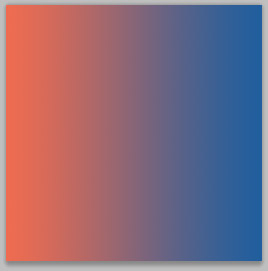
Gradients aren't pixel art.
Gradients: Choosing two colors and calculating the ones between them in a space interval. Looks cool but not pixel art!
Blurs aren't pixel art
Blur tools: Identifying the pixels and replicating/editing them to make a new version of the previous image. Again not pixel art.
Anti-aliasing isn't pixel art
Anti-alias tools generate new pixels in different colors to make something look ‘smoother’. You should avoid them for now.
Some would say that even automatically generated colors are not pixel art, implying that layer blending effects that mix pixels between two layers in a preset algorithm are not allowed. But since most hardware nowadays can deal with millions of colors, you can ignore this. Nevertheless, using fewer colors is a good practice of pixel art.
Other tools such as the line tool or the paint bucket tool also automatically generates pixels. However, you can configure them to not anti-alias their edges, giving you control over every pixel they fill, so they are “pixel art friendly”.
In the end, pixel art is all about taking great care about the placement of each pixel in a sprite, most often manually and with a limited palette of colors. Let’s try it out!
Getting Started
Before you start making your first pixel art asset, you should be aware that pixel art is not easily resizable. If you try to scale it down, it will look like a mess. If you try to scale it up, it can look OK as long as you use a multiple of two. However, it will look more pixelated.
To avoid this problem, you should first put some thought into exactly how large you want your game character/enemy/game element to be before you get started. This should be based on the screen size of the device you’re targeting, and how large you want the “pixels” to look.
For example, let’s say you want the game to look double-sized on an iPhone 3GS (“I really want to give a retro, pixel look to my game!”), which has a resolution of 480×320 pixels. Then your working resolution will be half of that size, or 240×160 pixels.
Open a new canvas on Photoshop by selecting File ▸ New… and set it to 240×160 pixels so you can look at it and choose the size for your character.
There: 32x32 pixels!
I chose 32×32 pixels not just because it seems good enough for this resolution, but 32×32 pixels is also a power of 2, which is handy for game engines. Tile sizes are often a power of two, textures are padded to a power of two, etc.
Making Your First Character
Pixel art is well known, when it’s done well, for its sharp and easy-to-read graphics: You can identify the character’s face, eyes, hair and body parts with just a few pixels. However, the developer size is much more complicated: The smaller your character is, the more difficult it is to make everything fit.
To make things more practical, choose what the smallest readable thing on the character will be. I always choose the eyes, because they are (magically) one of the best ways to give life to a character.
In Photoshop, choose the Pencil tool. If you can’t find it, just press and hold the Brush Tool and scroll down to Pencil Tool (it should be the second one). You will just need to resize it to brush size 1. Do they by clicking the tool options bar and changing its size or by holding the [ key.
You will eventually need the Erase tool too, so click it (or press E) and change its settings to Mode: Pencil so it doesn’t anti-alias as a brush.
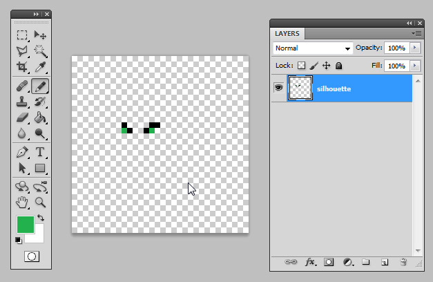
And start pixeling! Draw two eyebrows and an eye on the image, kinda like this:
Yay! I'm pixelling!
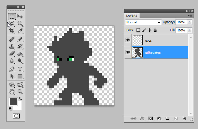
You could already start with the lineart (drawing as you normally would, making the lines and shaping the character), but a more practical way to do so is to first make its silhouette. The good thing is that you don’t need to be perfect on this stage, just try to take the sizes of things (head, body, arms, legs) and the character’s initial pose.
Go ahead and draw something like this with a gray color:
Doesn't need to be perfect at this stage
Notice that I also left some blank space. You don’t really need to fill the whole canvas, you’ll need more space for future different frames, and it’s very useful to keep the same canvas size for all of them.
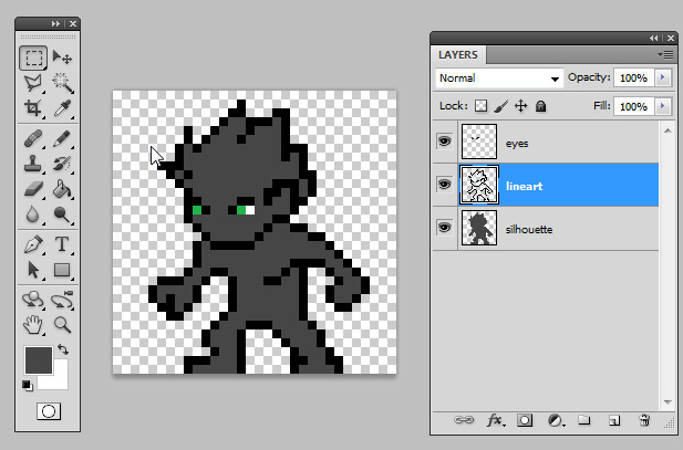
Once you finish the silhouette, it’s time to begin the lineart. Now you should be more careful with pixel placement, so don’t bother making the clothes, armors or any details yet. If you need it, you can add a new Layer so you never lose your original silhouette.
If you feel that the Pencil tool is a bit too slow to draw, you can always use the Line tool to speed things up. Just remember, you’ll need to fix some pixels because the Line tool is not as exact as the Pencil. You’ll need to configure it though, as shown below:
Choose the Line tool by pressing and holding the Rectangle tool and scrolling down to Line.
Go to the tool settings bar and select the third icon, Fill pixels. Change the Weight to 1, if it isn’t already, and uncheck Anti-alias (your nemesis!). It should look like this:
Tip: Notice that I didn’t make the bottom outline for the feet. It’s not really necessarily AND you save a row of pixels in your canvas.
Tip: Notice that I didn’t make the bottom outline for the feet. It’s not really necessarily AND you save a row of pixels in your canvas.


