1.
Book Overview & App Preview
Written by Prateek Prasad
The past decade has seen significant technological innovation. Smartphones, which were considered a luxury not long ago, have become mainstream, and internet connectivity is accessible to a broader demographic. Not only has this enabled users to express themselves in new ways, it’s drastically skewed what “computing” means by moving these capabilities out of an office and into the palm of their hands. For many users, a smartphone is their very first computer.
This is nothing short of a paradigm shift that has fundamentally altered numerous aspects of our lives. It’s made the world a smaller place by bringing people closer to one other. It has altered our social behavior and caused entirely new industries to spring up. It’s mind-blowing to realize that the phones we have on us at all times are exponentially more capable than the computers that landed humans on the moon.
Looking back at how this ecosystem has evolved, we can see that even the entry-level devices available today are significantly more capable than their premium counterparts were in the early days. Smartphones now have more sophisticated interfaces, graphics and animations and ship with many more sensors to accurately analyze the world around us.
This translates into smarter, more capable apps that solve a host of problems — and do it with delight. It’s hard to find an industry that apps haven’t impacted. It’s far easier to reach out to your audience and offer your services if you have an app. This has made distribution more effortless and has leveled the playing field for everyone. But it’s also made it more important to know how to design an app that goes beyond pure utility.
Why design matters
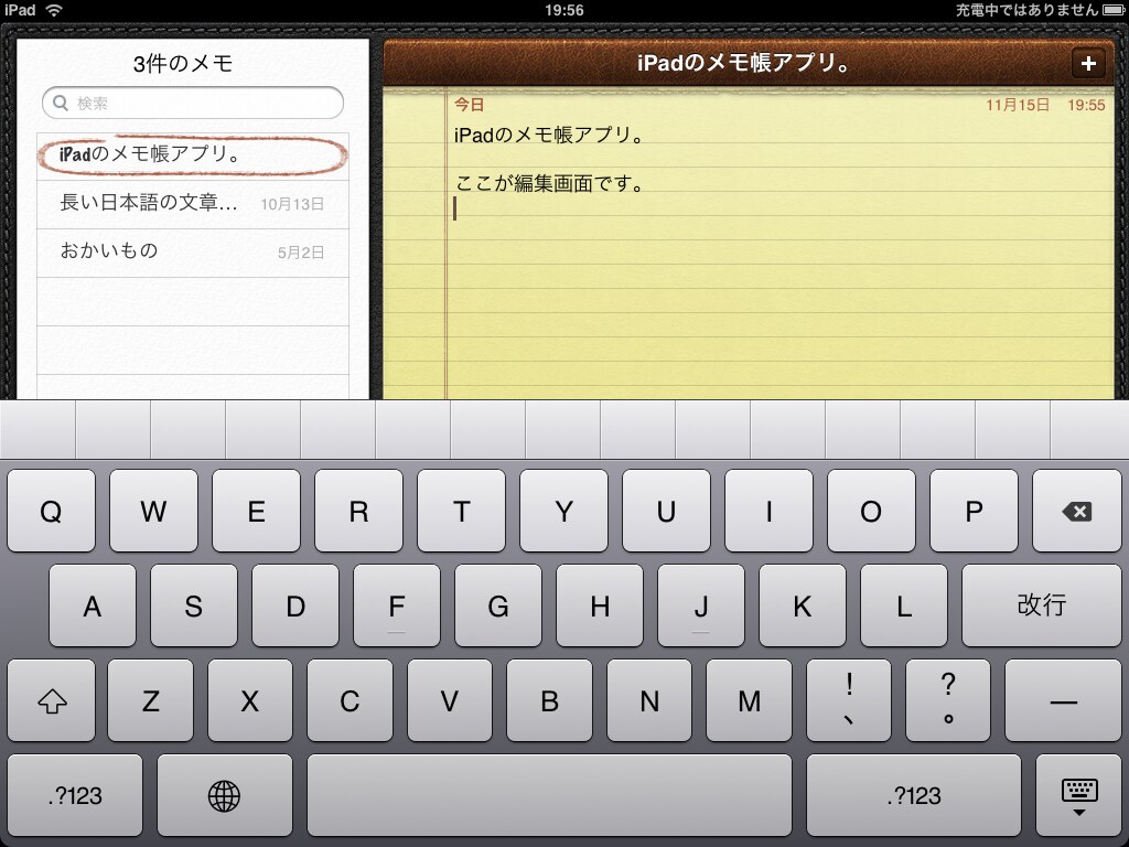
With smartphones becoming mainstream, our perception of design and how design impacts us daily has changed as well. With the original iPhone, apps tried to mimic the real world with what’s called skeuomorphic design. And they did this for a good reason. The iPhone was an entirely new device, the first in its category, so the only mental model users had when they came to it sprang from using real-world objects.
Notes were literal sheets of paper with tears at the top. Contacts looked like a physical address book and there was liberal use of wood and leather across the board. Looking back at it now, it looks dated and maybe even childish to some of you. But it was revolutionary at the time.

As humans, we rely on habits to interact with the physical world. We don’t need to learn how to use a notebook every time we buy one because we’re already familiar with them. The original iPhone leveraged these tendencies. Coming as close as possible to real-world objects made it easier for users to transfer their habits to a thin sheet of glass and make that cognitive leap.
Ten years later, we no longer need to mimic the real world — but it’s invaluable to reflect upon the journey. As technology has advanced, user’s expectations from apps have also changed. An app doesn’t just need to work. It has to look good, feel intimate and familiar, and be delightful while still being unique enough to attract attention and establish its identity.
That’s where this book fits in. It will teach you how to integrate design decisions to your apps. You’ll learn how to go beyond merely functional apps to create well-made, well-considered ones.
About this book
The book starts from the beginning, assuming you have no prior experience. It covers all the basics, such as layout and composition, color and typography, flow and transitions, and more. You’ll use Figma, a modern design app, to learn the fundamentals of the craft while learning how to use the tool itself. You’ll apply the lessons you learn to a sample app for a single point of reference throughout the book.
Movie tracking app
In this book, you’ll design Cinematic, an app for tracking movies. The app allows users to view trending and top-rated movies and make a list of movies they wish to watch.
Here’s how it looks:

Assumptions about the audience
This book is for you if you are:
- Someone with no prior design experience or training.
- Someone with no familiarity with specialized design tools like Photoshop, Sketch or Figma.
- Unable pay for design tools, unless you can use them as a regular part of your workflow.
- Unable to hire a designer for your projects.
- Someone who wants to do more of the design on your own or level up your skills.
Chapter summaries
Here’s a synopsis of each chapter as a preview of what to expect:
-
Book Overview & App Preview: This is the chapter you’re currently reading. Get an overview of the book including a brief look at what’s coming up in each chapter. Set up your Figma design workspace and learn how to access the project files. Jump in and get started right away with a quick project.
-
Tour of Workspace & Figma Fundamentals: Get an introduction to key tools in Figma like shapes, frames, sizing, alignment, colors and layers and apply your learnings to design a screen from scratch.
-
App Teardown: Trace over provided screenshots for two popular apps to study their layout and identify patterns and structures used to build them.
-
Wireframing & Screen Layout: Learn about the importance of wireframing and how to incorporate it into your design process. Create wireframes of a few screens and their components and build a scaffold of the app flow by defining the navigation between screens.
-
Reusable Elements & Data: Learn to build reusable components for common UI elements like buttons, toolbars and content cards. Incorporate sample text and image data for more realism. Leverage resuable components for faster iterations and to build more flexible designs.
-
Typography: Learn typography basics for communicating hierarchy, order and emphasis.
-
Colors: Gain an overview of color basics by learning common practices and creating palettes. Create visual styles for consistency throughout the app.
-
Transitions & Animations: Explore the prototyping tools to create a full app walkthrough. Create different transitions between screens to communicate the relationship among elements.
-
Feedback & Testing: Explore the collaboration tools to test designs on multiple devices and solicit feedback about the app goals and overall user experience.
-
Design Systems & Visual Language: Learn how to build a design system to establish brand consistency. Gain insights into fundamental design decisions by analyzing Apple’s Human Interface Guidelines and Google’s Material Design.
-
Recap & Next Steps: Review of the lessons learned and how to apply them when starting from scratch. Sources for inspiration and useful resources. Suggestions for continued learning and mastering design skills.
Starter files
Each chapter comes with starter files to make it easier for you to focus on the topic lessons, rather than fiddling with setup issues.
The files are Figma files with a .fig extension. You’ll also have access to final versions of each chapter file for reference.
Setting up Figma
Figma is a relatively new design app that’s rapidly gaining popularity. It’s comparable to Sketch or Adobe Photoshop, with standard tools for drawing shapes, using fonts, images, colors, etc. It also has built-in prototyping features to simulate interactive walkthroughs.
Some of Figma’s best features are that it:
- Is a cross-platform app.
- Is free to use for up to three projects, which is sufficient for this book.
- Has a vibrant third-party plugin ecosystem to enhance your workflow.
- Has apps on iOS and Android, which means you can view and interact with the projects on whichever device you use.
Sign up
Create an account at figma.com.
Launch the app
While Figma comes with native apps for both Mac and Windows, for the purposes of this book, you’ll use Figma on the browser to keep things consistent across chapters.
Log in to your newly created Figma account on figma.com
Install the Mirror app
Finally, download the Figma Mirror app for your iOS and Android devices. You can find links at figma.com/downloads or search for Figma Mirror in the iOS App Store or the Google Play store.
Taking Figma for a spin
Here’s what you’ll learn in this first chapter:
- Importing a design to Figma
- Creating a prototype
- Adding a button element to your design
Getting started
Log in to Figma, if you haven’t yet. If you’re inside a new file that Figma created for you, click the top-left navigation button and select Back to Files.

Select the Drafts tab, where you’ll find three pre-installed projects from Figma. You’ll see something similar to this image:

Next, find chapter-1-starter.fig in the book downloads and drag it into the Figma app window to import the project.

Double-click chapter-1-starter to open the project.

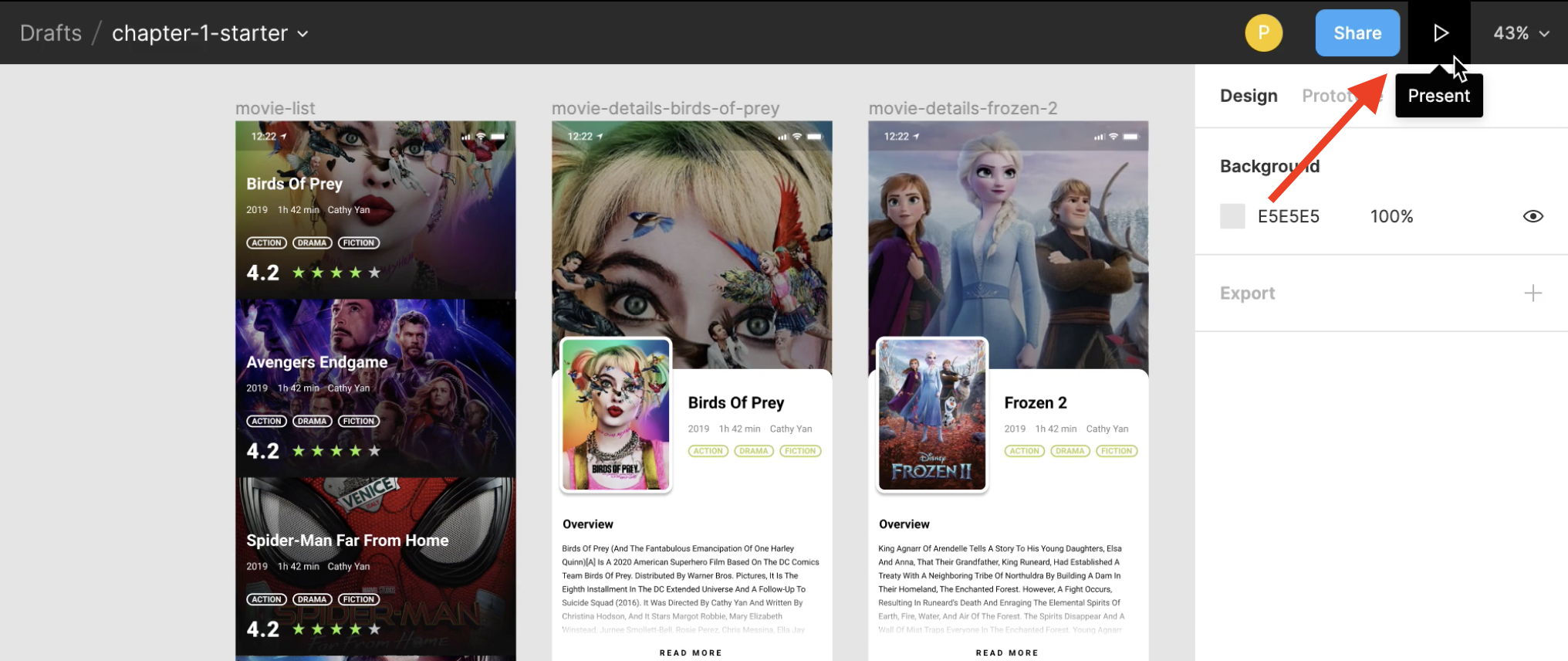
The project has three frames that represent three screens of the app. The movie-list frame shows a list of movies under the Trending category, while two movie details frames show the details of the movies “Birds of Prey” and “Frozen 2”.
These screens may look static, but it’s an interactive prototype.
Viewing as an interactive prototype
To interact with the prototype, click the Present button from the Toolbar. You’ll find it at the top-right corner of your screen.

A new browser tab will open with the movie-list screen inside an iPhone 11 Pro Max device frame. The list is scrollable, but the status bar and the bottom navigation stay anchored.

If you click anywhere on this browser tab, the interactive components will flash, indicating where you must click. In this case, it’s the Birds of Prey movie card, which is the first item on the list.

Clicking the card takes you to the details screen for the movie. You can scroll through the screen and see the different sections.

Having the ability to design and prototype the interactions in one tool is powerful and reduces a lot of friction and back and forth in typical design workflows.
As a quick-start exercise, you’ll link the Frozen 2 movie screen to its detail screen. Also, there’s no way for you to navigate back to the movie-list screen as of now. You’ll build a Close button to exit the details screen.
This quick exercise will get your hands dirty and give you a feel for the process. The upcoming chapters will go deeper into individual aspects of the tool and the process but for now, go have some fun!
Creating a link between two screens
Go back to the Figma editor window and click on the Prototype option in the Properties panel on the right.

In the Layers panel on the left, expand the movie-list frame, and select the frozen-2 group as shown below.

You’ll see a o button on the right edge of the card.

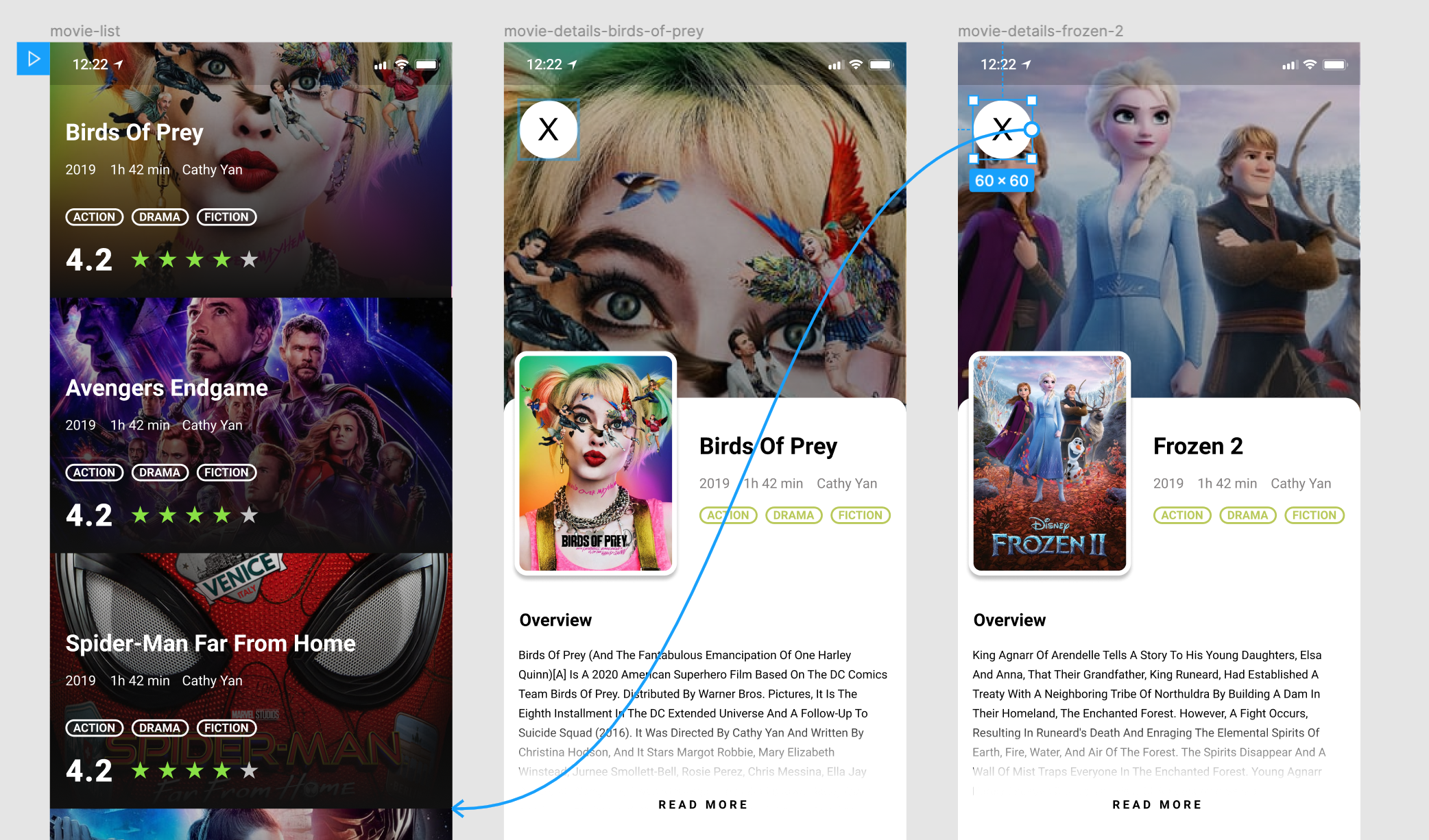
When you hover over the o it will turn into a +. Click on the + and drag the arrow to the movie-details-frozen-2 frame. This links the Frozen 2 card to its details screen.

An Interaction Details menu will appear, detailing the animation, navigation and transition properties. Leave everything at their default values and close the menu by clicking the X at the top-right.

Click the Present button again to view the interactive prototype. You’re now able to navigate to the Frozen 2 movie details screen by clicking the card in the list.
Awesome job building your very first interaction! You’ll now create a Close button to go back to the movie-list screen.
Adding a button to the details screen
Go back to the Editor tab and click the Design option in the Properties panel on the right.

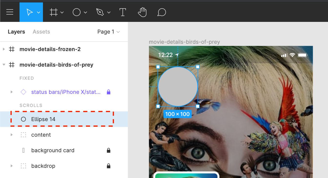
From the Toolbar on top, click Shape Tools and select Ellipse (O).

Now, click anywhere on the movie-details-birds-of-prey frame. This will add a 100x100 circle to the screen. You’ll find this option in the Layers panel to your left, as well.

Select the circle by clicking it, then give it the following properties:
- X = 16
- Y = 60
- W = 60
- H = 60

Note: X and Y values define the X and Y coordinates of this circle, while W and H represent its width and height.
You’ll now change the color of the button. To do so, select the Fill option from the Properties panel on the right and give it a white (#FFFFFF) fill.

Instead of manually creating the X symbol using lines, you’ll cheat a little and use the letter X to keep things simple. Sneaky right?
From the Toolbar at the top, select Text (T) and click inside the circle to add a text layer.

Type X in uppercase in the text layer.

From the Text section of the Properties panel, give this layer a font size of 32 and use the Roboto font with the Regular weight.

The X is not centered in the circle yet. To fix that, hold Shift and select both the circle and the text layer.

Now, select Align Horizontal Centers to align the two layers horizontally.

Next, select Align Vertical Centers to bring the text into the circle’s center.

It’s time to group the layers. Keeping both the circle and the text layer selected, right-click and select Group Selection.

Note: Grouping two layers wraps them into one entity, letting you move and resize all enclosing layers collectively. This comes in handy when working with UI elements that consist of many smaller parts.

Double-click on the group in the Layers panel and name it close-button.

Great job building your first button! Now, it’s time to link your button to the movie-list screen so you can go back to the list from the details screen.
Start by clicking the Prototype option from the Properties panel. Now, select close-button from the Layers panel and click on the ○ and drag a link to the movie-list frame.

Go back to the interactive prototype by clicking Present. You can now return to the movie-list screen by clicking the Close button on the details screen.

You need to add the Close button to the movie-details-frozen-2 screen as well. Instead of creating it from scratch, select close-button and press Command/Control-C to copy the button.
Now, select the movie-details-frozen-2 frame and press Command/Control-V.

Not only will this copy the button along with the correct positioning, but it will copy the link you created earlier as well.
Go back to the interactive prototype by clicking the Present button and you’ll see the Close button on the Frozen 2 details screen.
Previewing on a device
To take your prototyping to the next level, deploy your prototypes to a physical device and interact with them. Install the Figma Mirror app from the App Store or Play Store and log in to your Figma account.

All you need to do now is select the frame you want to view on your device, and voilà, it will appear. It’s fully interactive.
Note that the prototype may not fit perfectly on your device due to the size differences, but Figma Mirror still does an excellent job of scaling the designs — close to perfection.
Great job with the quick-start exercise! You built your first UI element and interaction from scratch. This is quite an achievement and you should be proud of yourself. Even though you haven’t thoroughly dived into Figma yet, this introduction hopefully gave you a quick look into what you’ll finally be able to build from scratch after going through this book.
Key points
- You set up your workspace by creating a Figma account.
- You learned how to import designs into Figma.
- You went through a quick-start exercise to add a Close button using shapes, text and alignment.
- You added an interaction to navigate back to the main screen.
- You deployed your interactive prototype to a physical device.