Scaling
Your classifier is already pretty good now, but you can still improve upon a precision of around 56%. One thing you always want to do is scale your dataset to be in the range of 0 to 1. Most classification algorithms will behave badly when datasets have columns with different scales of values. In this case, education ranges from 0 to 50, and income can be anywhere from 0 to virtually unlimited.
Replace the entire estimator cell with the following:
scaler = StandardScaler()  # 1
param_grid = dict(C=np.logspace(-5, 5, 11), penalty=['l1', 'l2'])
regr = LogisticRegression(random_state=RANDOM_STATE)
cv = GridSearchCV(estimator=regr, param_grid=param_grid, scoring='average_precision')
pipeline = make_pipeline(scaler, cv)  # 2

pipeline.fit(X_train, y_train)

# 3
y_true = y_test
y_pred = pipeline.predict(X_test)
y_score = pipeline.predict_proba(X_test)[:, 1]
Here's what this does:
- You create a standard scaler.
- You create a pipeline object that first scales the data and then feeds it into the grid search.
- You can use the pipeline as if it were an estimator. You can call
fit and predict on it, and it will even use the grid search's best estimator by default.
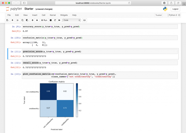
Run all the metrics cells again. The precision has increased to 72%!

ROC
Before wrapping up your classifier, there is one more metric you should always look at: ROC AUC. It is closely related to the confusion matrix, but also incorporates the predicted probabilities — or scores of a classifier. It ranges from 0 to 1 as well, where higher is better.
Intuitively, it measures how much better than random the score predictions are.
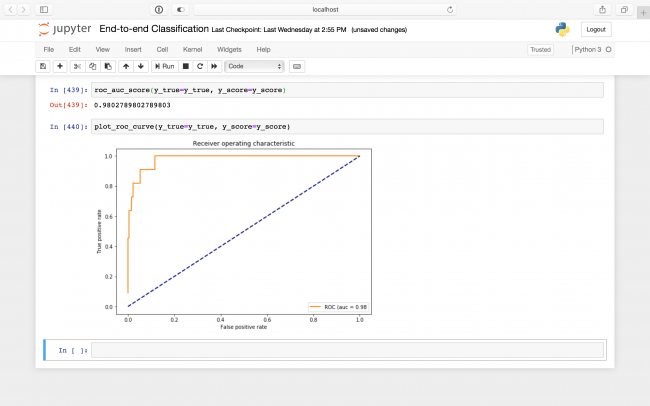
It does this by cutting off the probability scores at various thresholds and it rounds them down to make a prediction. It then plots the true positive rate — the rate of predicted creditworthy people who were actually creditworthy, or just the recall from above — against the false positive rate, which is the rate of predicted creditworthy people who were actually not creditworthy. This plot is called the ROC (receiver operating characteristic), and the metric ROC AUC (area under curve) is just the area under this curve!
Add the following code blocks to the bottom of your notebook into two new cells and run your cells one more time:
roc_auc_score(y_true=y_true, y_score=y_score)
plot_roc_curve(y_true=y_true, y_score=y_score)

A ROC of 0.98 indicates your predictions are quite good!
Where to Go From Here?
Congratulations! You just trained an entire classifier; great job.
This tutorial has provided you with some of the most commonly used strategies you'll come across when working on your own classification problem.
The final notebook, included in the materials for this tutorial, also includes code to export a CoreML model from your classifier, ready to drop right into an iOS application.
Experiment with different combinations of input parameters, classification algorithms, and metrics to tweak your model to perfection.
We hope you enjoyed this tutorial and, if you have any questions or comments, please join the forum discussion below!

