How to Create a Splash Screen With SwiftUI
Learn to build a splash screen that uses animation and SwiftUI to go beyond the typical static launch screen and keeps users interested while the app loads. By Rony Rozen.
Sign up/Sign in
With a free Kodeco account you can download source code, track your progress, bookmark, personalise your learner profile and more!
Create accountAlready a member of Kodeco? Sign in
Sign up/Sign in
With a free Kodeco account you can download source code, track your progress, bookmark, personalise your learner profile and more!
Create accountAlready a member of Kodeco? Sign in
Sign up/Sign in
With a free Kodeco account you can download source code, track your progress, bookmark, personalise your learner profile and more!
Create accountAlready a member of Kodeco? Sign in
Contents
How to Create a Splash Screen With SwiftUI
20 mins
Improving the Circle Animation
Start by adding this code right after runAnimationPart1():
func restartAnimation() {
  let deadline: DispatchTime = .now() + uAnimationDuration
  DispatchQueue.main.asyncAfter(deadline: deadline) {
    self.percent = 0
    self.handleAnimations()
  }
}
And to call this method, add this line at the end of handleAnimations():
restartAnimation()
This code loops the animation by waiting for its duration to reset percent and then calling it again.
Now that the circle animation repeats itself, you can add modifiers to FuberU to make it look exactly like you want. First, add these new variables before body:
@State var uScale: CGFloat = 1
let uZoomFactor: CGFloat = 1.4
Now, between the stroke(_:lineWidth:) and onAppear() modifiers on FuberU, add these three new modifiers:
.rotationEffect(.degrees(-90))
.aspectRatio(1, contentMode: .fit)
.padding(20)
Finally, add a scaleEffect(_:anchor:) right before frame(width:height:alignment:):
.scaleEffect(uScale * uZoomFactor)
Your FuberU declaration now looks like this:
FuberU(percent: percent)
  .stroke(Color.white, lineWidth: uLineWidth)
  .rotationEffect(.degrees(-90))
  .aspectRatio(1, contentMode: .fit)
  .padding(20)
  .onAppear() {
    self.handleAnimations()
  }
  .scaleEffect(uScale * uZoomFactor)
  .frame(width: 45, height: 45, alignment: .center)
This code has made the line wider, added a rotation so that the drawing starts from the top and added a scale effect so that the circle grows while it’s animating.
Finish this part by adding the following line in runAnimationPart1(), inside the animation block, right after you update percent to 1:
uScale = 5
With this code, you’re changing the uScale state from 1 to 5.
Build and run your app:
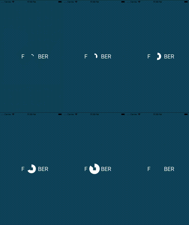
Now the circle behaves as you expected — your app draws a full white circle from 0 to 360 degrees, which grows a bit in the process.
You’ll probably notice that the circle only increases in size on the first draw cycle. That’s because you never re-initialized uScale. Don’t worry, you’ll address this in the next step of the animation.
FuberU modifiers — remove some, add new ones, change the values and so on. As you observe the view changes, you’ll better understand what each modifier does.Adding the Square
With the animations of the Fuber ‘U’ complete, it’s time to add the square.
To start, add these new states and properties before body:
@State var squareColor = Color.white
@State var squareScale: CGFloat = 1

let uSquareLength: CGFloat = 12
Add a Rectangle view for the center square, right after FuberU in the ZStack:
Rectangle()
  .fill(squareColor)
  .scaleEffect(squareScale * uZoomFactor)
  .frame(width: uSquareLength, height: uSquareLength, alignment: .center)
  .onAppear() {
      self.squareColor = self.fuberBlue
  }
You’ve added a square, with a size and fill color that will each change throughout the animation.
Build and run your app:
As you can see, the circle appears behind the square at the expected size, but without animations. You still need to add all of the prep work, and then handle the animations in the right order.
Next up, the line!
Adding the Line
Now, you’ll need to add the line to make your ‘U’ look more like the letter ‘U’ and less like a circle with a square on top of it.
Add the following properties and states before body:
@State var lineScale: CGFloat = 1

let lineWidth:  CGFloat = 4
let lineHeight: CGFloat = 28
Then add a Rectangle view at the end of your ZStack, right before Spacer.
Rectangle()
  .fill(fuberBlue)
  .scaleEffect(lineScale, anchor: .bottom)
  .frame(width: lineWidth, height: lineHeight, alignment: .center)
  .offset(x: 0, y: -22)
Build and run your app:
Now that you have all of the elements for the Fuber ‘U’, you can make the animation a bit more complex. Are you ready for the challenge?
Completing the U Animation
The ‘U’ animation you want to make has three stages:
- The circle zooms in as it’s drawn.
- The circle quickly zooms out into a square.
- The square fades away.
You’ll use these three stages as you expand your existing handleAnimations(). Start by adding these new properties right after uAnimationDuration:
var uAnimationDelay: Double { return  0.2 }
var uExitAnimationDuration: Double{ return 0.3 }
var finalAnimationDuration: Double { return 0.4 }
var minAnimationInterval: Double { return 0.1 }
var fadeAnimationDuration: Double { return 0.4 }
These magic numbers are the result of trial and error. Feel free to play around with them to see if you feel they improve the animation, or just to make it easier for you to understand how they work.
Add one more line to the end of runAnimationPart1(), right after uScale = 5:
lineScale = 1
Add the following code to the end of runAnimationPart1(), right after the animation block’s closing brace:
//TODO: Add code #1 for text here

let deadline: DispatchTime = .now() + uAnimationDuration + uAnimationDelay
DispatchQueue.main.asyncAfter(deadline: deadline) {
  withAnimation(.easeOut(duration: self.uExitAnimationDuration)) {
    self.uScale = 0
    self.lineScale = 0
  }
  withAnimation(.easeOut(duration: self.minAnimationInterval)) {
    self.squareScale = 0
  }

  //TODO: Add code #2 for text here
}
Here, you use an async call with a deadline to run the code after the first animation runs. Notice you have some placeholders for text animations; you’ll address these soon.
It’s time for the second part of the animation. Add this after runAnimationPart1()‘s closing bracket:
func runAnimationPart2() {
  let deadline: DispatchTime = .now() + uAnimationDuration +
    uAnimationDelay + minAnimationInterval
  DispatchQueue.main.asyncAfter(deadline: deadline) {
    self.squareColor = Color.white
    self.squareScale = 1
  }
}
Make sure to add a call to your new function right after runAnimationPart1() in handleAnimations():
runAnimationPart2()
Now, add the third part of the animation after runAnimationPart2():
func runAnimationPart3() {
  DispatchQueue.main.asyncAfter(deadline: .now() + 2 * uAnimationDuration) {
  withAnimation(.easeIn(duration: self.finalAnimationDuration)) {
    //TODO: Add code #3 for text here
    self.squareColor = self.fuberBlue
  }
  }
}
Note that the code contains TODOs to show the exact places where you’ll animate the text later in this tutorial.
Now, add your new animation in handleAnimations(), right after runAnimationPart2():
runAnimationPart3()
To finish this stage, replace restartAnimation() with this new implementation:
func restartAnimation() {
    let deadline: DispatchTime = .now() + 2 * uAnimationDuration +
      finalAnimationDuration
    DispatchQueue.main.asyncAfter(deadline: deadline) {
      self.percent = 0
      //TODO: Add code #4 for text here
      self.handleAnimations()
    }
}
Note that you scheduled each step of the animation to start at a certain point based on the “magic numbers” you defined for that specific step.
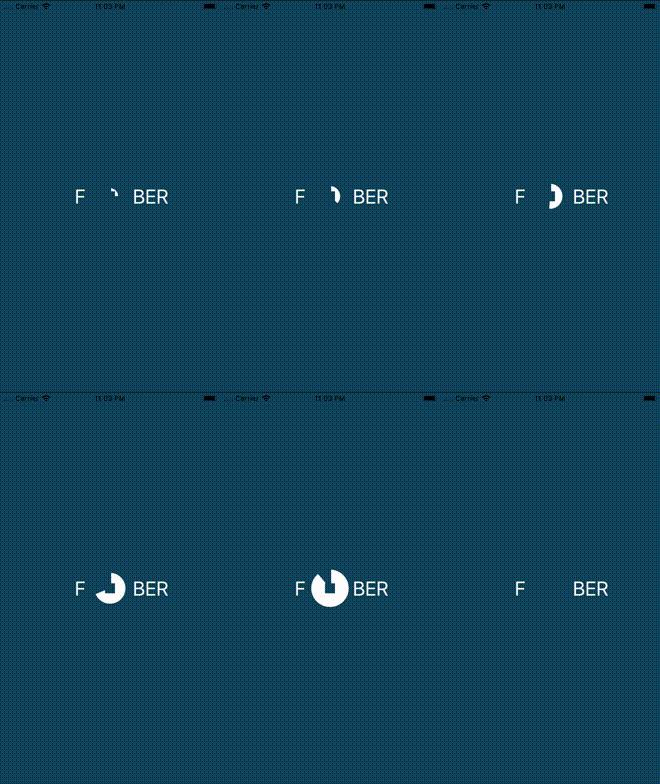
Build and run your app, then observe the prettiness! :]
If you look at the finished animation, you’ll see that the text starts transparent and small, then fades in, zooms in with a spring and, finally, fades away. It’s time to put all that in place.


