Android SDK Versions Tutorial With Kotlin
New SDK versions released with each new version of Android provide great new features. In this tutorial we will learn how to utilize them in our apps. By Kevin D Moore.
Sign up/Sign in
With a free Kodeco account you can download source code, track your progress, bookmark, personalise your learner profile and more!
Create accountAlready a member of Kodeco? Sign in
Sign up/Sign in
With a free Kodeco account you can download source code, track your progress, bookmark, personalise your learner profile and more!
Create accountAlready a member of Kodeco? Sign in
Sign up/Sign in
With a free Kodeco account you can download source code, track your progress, bookmark, personalise your learner profile and more!
Create accountAlready a member of Kodeco? Sign in
Contents
Android SDK Versions Tutorial With Kotlin
20 mins
- Getting Started
- Emulating Different SDK Versions
- Creating a Virtual Device
- Downloading a System Image
- Running the Sample App
- SDK Versions and API Levels
- Backward Compatibility
- Android Support Libraries
- AndroidX Support Libraries
- Using an Android Support Library
- Update Build File
- Updating for Backward Compatibility
- Updating Fragment Classes
- Updating Styles
- Using the CardView Support Library
- Did You Say Material Design?
- Where to Go From Here?
Updating Fragment Classes
Open DescriptionFragment.kt and MainFragment.kt, find the following line:
import android.app.Fragment
And update to match the following:
import android.support.v4.app.Fragment
Here, you’re using the support version of the Fragment class instead of the one in the main SDK. The latter can only be used in apps with a minSdkVersion of 14 and above.
android.support.v4.app package.
So far, you’ve replaced all the main API calls with corresponding methods from the Support Library. Next you will need to update your layout files to use the Support Library.
In the res / layout folder, open toolbar_custom.xml and do the following:
- Change
android.widget.Toolbartoandroid.support.v7.widget.Toolbar - Change
?android:attr/actionBarSizeto?attr/actionBarSize
Again, all this does is change the package name from android to v7-appcompat.
Now that all of the compile-time errors have been checked and fixed, try to run the app again. You will now get the following run-time error:
java.lang.RuntimeException: Unable to start activity ComponentInfo{com.raywenderlich.continents/com.raywenderlich.continents.MainActivity}: java.lang.IllegalStateException: You need to use a Theme.AppCompat theme (or descendant) with this activity.
Updating Styles
The error message is pretty self-explanatory, but why do you need to use the AppCompat theme? A feature from the Lollipop release of AppCompat is the different approach to theming. One of the interesting things about this is the capability to get an L-friendly version of your app on prior versions. If an app uses the framework version of everything (Activity instead of AppCompatActivity for example), it would only get the material theme on phones with the L release. Devices with prior releases would get the default theme for those releases. The goal of the AppCompat theming feature is to have a consistent experience across all devices.
In the res\values folder, open styles.xml, and change android:Theme.Black.NoTitleBar to Theme.AppCompat.NoActionBar.
Now, build and run. You can test the app on an API 16 device or emulator as well.
Well done! The sample app is now backward compatible. Ice cream sandwich, lollipops and jelly beans for everyone!
Now, throw in some cards to make the detail screen look nicer.
Using the CardView Support Library
Open build.gradle for the app module and add the following to the dependencies section:
implementation "com.android.support:cardview-v7:28.0.0"
Now, sync your project. Adding this declares the v7-cardview Support Library as a dependency for the app.
Open the fragment_description.xml file and place the ImageView in a CardView:
<android.support.v7.widget.CardView
    android:id="@+id/card_view"
    android:layout_width="match_parent"
    android:layout_height="0dp"
    android:layout_gravity="center"
    android:layout_weight="1"
    card_view:cardBackgroundColor="#316130"
    card_view:cardElevation="20dp">
    <ImageView
      android:id="@+id/continentImage"
      android:layout_width="match_parent"
      android:layout_height="match_parent"
      android:contentDescription="@string/continent_image_description"
      android:paddingBottom="@dimen/activity_vertical_margin"
      android:src="@drawable/africa" />
</android.support.v7.widget.CardView>
Notice that when using widgets from the Support Library, some XML attributes (cardBackgroundColor and cardElevation for the CardView) are not prefixed with “android.” That’s because they come from the Support Library API as opposed to the Android framework. Press Option-Return (or Alt-Enter on PC) if you need to set up the card_view namespace in the .xml file.
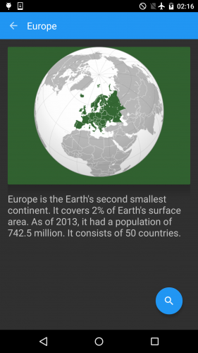
Now, build and run the project:
Cool, you’ve added this new-style CardView to your app and using the compatibility library it works from modern versions of Android, right back to ancient API-level 16.
Did You Say Material Design?
You’ve successfully used the AppCompat theming to give the app the Android Lollipop look and feel across a wide range of SDK versions. In addition to these elements, the Material Design specification includes many more patterns and widgets not contained in AppCompat. This is where the Design Library comes into play. It provides widgets such as navigation drawers, floating action buttons, snackbars and tabs. Let’s include it in the project and add a floating action button.
In build.gradle, add the following in the dependencies section:
implementation "com.android.support:design:28.0.0"
Next, add the following XML element above the closing tag for FrameLayout in fragment_description.xml:
<android.support.design.widget.FloatingActionButton
    android:id="@+id/search_button"
    android:layout_width="wrap_content"
    android:layout_height="wrap_content"
    android:layout_gravity="bottom|end"
    android:layout_margin="16dp"
    android:src="@drawable/ic_search_white_18dp" />
Build and run. You will see the floating button as expected.
Where to Go From Here?
Congratulations! Finally, you’ve learned about Android SDK versions and their sweet code names. You made an API Level 28 app, backward-compatible to API Level 16, and used the CardView and design library to add additional components. You might also have a sugar craving. :]
Blame Android.
The final project for this Android SDK Versions tutorial can be downloaded by clicking on the Download Materials button at the top or bottom of this tutorial.
If you are interested in the Android SDK version history, check out this wikipedia page or the versions page on the Android developer site. You can also read further about the minSdkVersion and targetSdkVersion attributes from the manifest page on the developer site. Finally, check out the developer pages on Support libraries and its feature list.
We hope you enjoyed this Android SDK Versions tutorial, and if you have any questions or comments, please join the forum discussion below!


