OS X Stack Views with NSStackView
In this tutorial you will learn how to use stack views to design your OS X app’s layout by leveraging the power of NSStackView. By Marin Todorov.
Nesting Stack Views
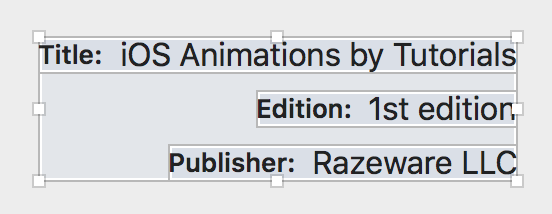
You’ve seen how easy it is to organize labels in stacks; it cost you a few little clicks. But wouldn’t it be great if you could somehow organize the three rows of text you ended up with too?
Good news — this task is almost as easy! First of all, find the document outline button towards the lower-left corner of Interface Builder, and in case you don’t already have document outline pane open, click the button to do so.
In your document outline, select the three stack views while holding the Command key on your keyboard, like so:

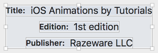
I hope you already guessed the next step. Click the Stack button in the bottom right to stack together those…stack views!
Now you have three horizontal stack views stacked vertically! It looks like a little table, and that’s precisely what you wanted.
Now it’s time to look into another property of stacks that you definitely need to use when nesting stacks. The alignment property (look it up in the Property Inspector while the stack view is selected) allows you to set how the views should be aligned in the alternate axis of the stack’s orientation:
- For Horizontal stacks, Alignment lets you arrange views on their top, center, bottom or base line
- For Vertical stacks, Alignment lets you arrange views on their leading, center and trailing
Feel free to play with the current stack’s orientation, but ultimately, set it to Center X to center all the text rows, like so:
Hey that looks pretty cool! And to keep momentum up, go ahead and take care of that cover image too. In the document outline, select both the stack view (the one you just created) and the book cover image:

I guess by now there’s almost no need to say it but in the spirit of being totally clear I will: click Stack to stack those two together! Set the orientation of the new stack to Vertical to arrange the image and the text above each other.

In your app, however, you want the image to appear above the texts, unlike the current arrangement. So, unfold the stack view in the document outline and drag the image view above to re-order the arranged views, like so:

The image view should remain a sub-view of its original parent and should just appear above the Stack View, which is its sibling. As soon as you do that the views will appear like this in Interface Builder:

Now change alignment to Center X and spacing to 12. This will center the image and text horizontally and add a bit of spacing between them.
Finally, select the last stack view you created and the Buy now from raywenderlich.com button. Again, click the Stack button and make sure orientation is set to Vertical, alignment is Center X and spacing to 50.
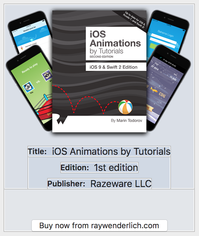
Your final layout should look like this:
Customizing the Stack
So far, you’ve created a number of stack views and hopefully you’re starting to feel like a pro. :] You have the default stack view configuration, however, and in this section you’ll see how customizing the default behavior can provide even more flexibility at almost no cost.

The stack views you created so far tutorial grew in size along with their content. In a way, you’ve only been “wrapping” views together for the sake of aligning them and nesting stacks.
Stacks though can behave a bit differently if you fix their size and let them arrange their sub-views within that given space.
Full Window Layout
So far, you’ve got two “top” layout elements in your app’s UI. The former is the table on the left, and the latter is the stack view that wraps all the details about a single book plus the purchase button.
No matter how you arrange those elements you ultimately want them to spread nicely within the app’s window.
In the document outline select the table view and the top stack view you have so far:

Next — no surprise here — click the Stack button at the bottom of the Interface Builder pane to stack the two selected views together, effectively bundling them into a new horizontal stack.
Now click on the Pin button, which is located close to the Stack button, and enter four zeroes in the four boxes at the top of the popup. Make sure the four red lines light up while you enter the numbers in.

Finally, click Add 4 Constraints to pin your top stack view to the window, effectively making it a “full window” view.
Just to make sure all views display correctly, click Resolve Auto Layout, located to the right of the Pin button, and choose Update Frames under All Views in View Controller. This will apply all current constraints and your layout will look like this:

Since the table view has a constraint that sets its width to 180 points, the stack view respects that and lets the other arranged view fill all of the remaining space. Run the project and try resizing the window.
The table view fills up the window vertically but it always keeps its width because the width is pinned with a constraint.
Shift your attention to the book details. As you resize the window, the cover image and the texts always stay centered. Since the stack that contains them grows or shrinks to fill up the space not taken by the table view, its sub-views always stayed centered.

This is all you needed to do to make your layout fill up the window. That was easy, n’est–ce pas?
Now look into another area of the layout where some of that same magic you just did could come handy.
Full Table Cell Layout
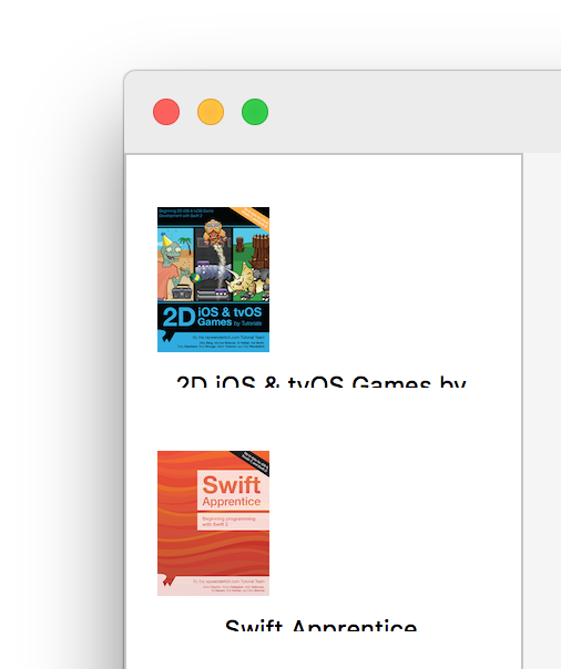
The table view doesn’t look all that nice at the moment, kind of like someone just threw in an image view and a label without any concern for alignment. Annoyingly, the text gets cut out at run time:
Time for you to add some stack view goodness to that table view.
In document outline, select the cell image and label. To do that, you’ll need to drill down through the view hierarchy as shown:

Aaaand…drumroll…you guessed it: click the Stack button in Interface Builder. This will bundle the image and label into a vertical stack view.
With the stack still selected, set the alignment to Center X. While you still have the stack selected, click on the Pin button at the bottom of Interface Builder and pin the stack to its parent view in all directions.

Since the nearest neighbor view of the stack view is the cell view, simply pin the stack to the cell itself. Click Add 4 Constraints to finish up and close the popup.
Select the stack view and click the Resolve Auto Layout issues button (to the right of Pin) and select Update Frames. The stack view takes up the whole table cell space and it now looks like this:

Run the app and note how the stack view makes your whole table layout work like a charm.
