Lessons Learned From the RWDevCon 2018 Design Lab
Recently two advanced UI/UX designers troubleshooted the design of many reader’s apps. Check out some common problems and solutions! By Luke Freeman.
Sign up/Sign in
With a free Kodeco account you can download source code, track your progress, bookmark, personalise your learner profile and more!
Create accountAlready a member of Kodeco? Sign in
Sign up/Sign in
With a free Kodeco account you can download source code, track your progress, bookmark, personalise your learner profile and more!
Create accountAlready a member of Kodeco? Sign in
Contents
Lessons Learned From the RWDevCon 2018 Design Lab
15 mins
- Design Lab? Sounds dangerous…
- The Design Lab Victims
- Top Lessons Learned
- 1. Gestalt Principles
- Example: Grouping by Proximity
- Example: Grouping With Colors and Lines
- 2. Native Components and Behavior
- 3. Competitor Research
- Example: Tinder vs. Bumble
- Example: Great Little Place
- 4. Copywriting
- Example: Button/Input Labels
- Example: Being Too Descriptive
- Where to Go From Here?
Design Lab? Sounds dangerous…
This year at RWDevCon 2018 held in Alexandria, VA, the conference boasted its very own Design Lab, and it was open to anyone who stopped by.
The Design Lab is a space wherein you can get help with any design-related questions you may have about your hobby or client mobile app — even if it is just in the idea stage.
We may be experienced designers but rest assured that we don’t bite; in fact, we admire the time and effort you’ve put into your apps. Making mistakes or having questions are an essential part of the learning process; we don’t punish you if there’s something we think you could improve in your app! Our Design Lab reviews are intended to help you create a better app for yourself and your users.
This article will give you insight into the top four design issues we saw again and again over the course of two days, working with developers like you. We hope the following examples will help answer some of your own questions and set your app up for success!
The Design Lab Victims
It was very inspiring to see the achievements of professional and hobbyist iOS developers as they develop their own apps, many thanks to the content published on raywenderlich.com; it was exciting to see the hard work of our tutorial writers, podcasters, screencasters and video teams pay off with the readers of the site.
We were also impressed by the variety of apps!
We saw a gardening fan who followed the tutorials on this website and taught herself iOS development, including CoreData, in order to manage her plants and get insights on her garden’s yield and costs.
There was an ML-powered stocks app, a fitness app, an app to search for movies that pass the Bechdel–Wallace test, ones to track medication, help in the Operating Room, view Mars Rover images, manage accounting, track equipment maintenance and to keep track of donations.
Of course, everything is a process, and we saw a number of similar issues that we’d like to share with you.
Top Lessons Learned
Across the dozens of apps we reviewed over the two days we ran the Design Lab, there was a list of issues that kept surfacing regardless of the app and its domain:
- Gestalt Principles
- Native Components
- Competitor Research
- Copywriting
1. Gestalt Principles
Ges-what?
Gestalt Principles describe how proximity, similarity and other visual characteristics change how we perceive visual elements. This is especially important when working with user interfaces.

The above image shows an app featuring a screen that contains an illustration, messaging and a button. Because the button is away from the messaging, it reads as a separate entity, creating confusion for the user. The simple solution is to place it in close proximity to the messaging it relates to.

In the above image the illustration, messaging and buttons are closer together. It’s clear the messaging and buttons are related.

Proximity is only one of the ways you can group elements; you can also use color or lines. In the first image above, you can see how a separator line can group two items that are on opposite edges of the screen. In the second image, Booking.com has used a yellow background to make it easy for users to interpret the fields as a single form.
2. Native Components and Behavior
Many of the apps we reviewed used custom components for common features such as search or navigation.

Angry Birds custom interface design matches the style of the game.
Some games and certain specialist apps have a good reason to abandon native components. For example, an app made to be used in an operating room may discard the standard navigation bar and associated edge gestures in favor of a single, large back button on top that needs to be pressed for duration of time in order to prevent accidental navigation while handling the device with gloves or when placing it down on a table.

The Xcode Interface Builder ensures you shouldn’t need to build common interface components from scratch.
But for the majority of the apps, using native components that are shipped with iOS and available within Xcode Interface Builder, will be the best approach.

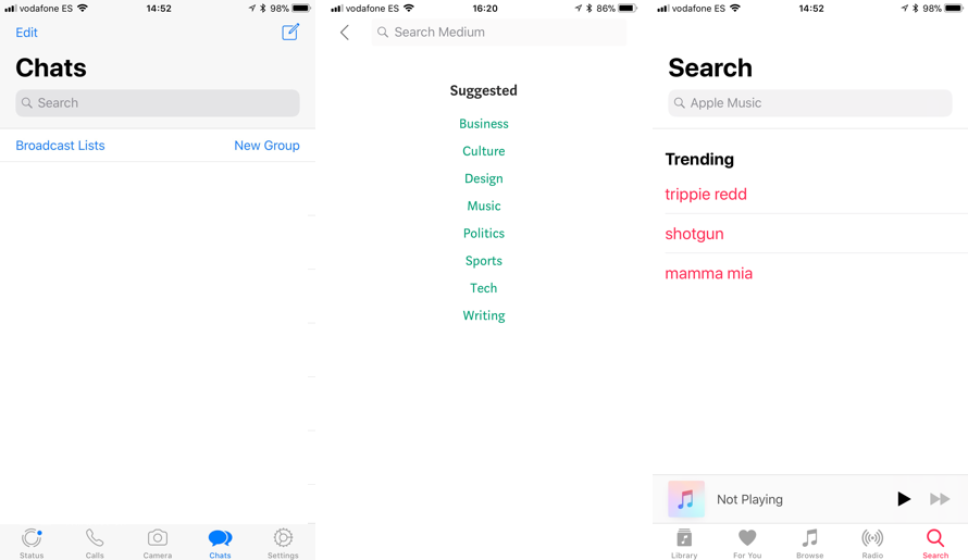
WhatsApp, Medium and Podcasts all utilizing the Interface Builder search component.
The reason for this is that your customers are already used to seeing these components in Apple’s own apps and many other third-party apps users have installed on their devices. So when they pick up your app, there’s nothing new to learn: They know that an edge swipe will take them back to the previous screen; they know that looking at the navigation bar will tell them where they are in the app; and they know that a text field with rounded corners and a magnifying glass gives them access to search.
Our recommendation is for you to get familiar with the native iOS components by reading the Apple Human Interface Guidelines, as well as Google’s Material Design Guidelines. These describe when each component is best used and more. Also pay attention to the apps you use on a daily basis and take note of which ones use native components and how.
All in all, native components save you from coming up with your own solution to an already-solved problem, and they make your users happier as they’ll feel more confident when using your app. Native components also come with support for accessibility features like Dynamic Text and VoiceOver, easier than implementing those yourself when you want to make sure everyone can use your app.
3. Competitor Research
It can be tempting to try and find a novel solution to a design problem. And as impressed as we were with the pioneering styles at the Design Lab, sometimes you can waste a lot of energy that could be better focused elsewhere. Before jumping into the code when designing a feature for your app, you might want to see what you can learn from your competitors’ designs. As Picasso famously said, “Good artists copy; great artists steal.”

Who wore it better?
When the dating app Bumble launched, the developers could have spent a lot of time researching new ways for users to interact and find matches. Tinder already pioneered the swipe-right interaction, but Bumble had no problem adopting the same technique as they recognized its success with similar users. Bumble created a profitable company by focusing its resources on other areas of design and development and making the app unique in alternative ways. Taking design patterns from competitors in a similar vertical to your own means they’ll likely have similar users with similar needs. This increases the designs success if your competitor has designed with their users in mind.

From swiping to scrolling: GLP changed its marketing to match its main interaction pattern.
The swipe-right design pattern wasn’t as successful for the restaurant recommendation app Great Little Place. When it initially launched, the UI was designed in a style similar to Tinder. This was unconventional as it was only possible to view restaurants one at a time. In a later version of the app, the developers switched to a more typical list view. They could have changed the design for numerous reasons, but taking ideas from designs in other verticals can be riskier as the user base is often vastly different.
Competitor research can save you time, money, resources and allow you to discover great ideas. Select some competitors and apps with similar features to yours. Then ask some users (friends or colleagues, if you are short on resources) to go through the apps while you watch. Give your test subjects common goals that you would expect them to achieve with your own app. Ask them to describe aloud why they made certain decisions or what features frustrate or delight them.
By examining how they interact with your competitors’ features, you’ll be able to see what works well. It’s IMPORTANT to TEST out competitor designs and not just choose what looks good. You might even discover ideas and techniques you never thought existed. The beauty of this testing is that you don’t have to build anything, and you’ll learn a lot in a short period of time.