Modern Collection Views with Compositional Layouts
In this tutorial, you’ll learn how to build beautiful, modern UICollectionView layouts using iOS 13’s new declarative UICollectionViewCompositionalLayout API. By Tom Elliott.
Sign up/Sign in
With a free Kodeco account you can download source code, track your progress, bookmark, personalise your learner profile and more!
Create accountAlready a member of Kodeco? Sign in
Sign up/Sign in
With a free Kodeco account you can download source code, track your progress, bookmark, personalise your learner profile and more!
Create accountAlready a member of Kodeco? Sign in
Sign up/Sign in
With a free Kodeco account you can download source code, track your progress, bookmark, personalise your learner profile and more!
Create accountAlready a member of Kodeco? Sign in
Contents
Modern Collection Views with Compositional Layouts
25 mins
The iOS Photos and App Store apps feature some complex layouts that are not possible out of the box with UICollectionViewFlowLayout, with multiple scrolling sections and variably size tiled layouts. You’re going to learn how to create those features in your own photo browsing app!
Getting Started
Download the project materials using the Download Materials button at the top or bottom of this tutorial. Open the starter project in Xcode. Build and run.
You will see a functional, but very simple, app displaying a photo album. You can scroll the list to view the photos in the album and tap on any individual photo to view the image in more detail.
Switch to Xcode and take a quick look around the project. Open AppDelegate.swift. When the app starts, it sets an AlbumDetailViewController as the initial view controller. The initializer for AlbumDetailViewController takes a URL to a folder containing images.
Open AlbumDetailViewController.swift. viewDidLoad() sets up a basic UICollectionView to display PhotoItemCells by calling configureCollectionView(), which configures the collection view data source using iOS 13’s new UICollectionViewDiffableDataSource.
Don’t worry if you haven’t come across UICollectionViewDiffableDataSource before! The important part to notice is that configureDataSource() calls snapshotForCurrentState(), which builds a data source snapshot from a list of photo URLs. It then applies the snapshot to the collection view data source.
Finally, in the UICollectionViewDelegate extension at the bottom of the file, you can see that the app navigates to a PhotoDetailViewController when the user selects an item.
If you’re interested, open PhotoDetailViewController.swift. It’s a very simple view controller class to display an image, nothing exciting going on there. :]
Why UICollectionViews? A Brief Recap
If you’ve never used UICollectionView before, it might be worth familiarizing yourself with the basics before continuing. This tutorial is a great place to start.
If you just need a quick recap, remember that UIKit provides two view classes for efficiently displaying large numbers of similar items: UITableView and UICollectionView. At first glance they appear very similar — both display a list of items optionally grouped into sections.
However, while table view can only display items in a vertical list, a collection view has a UICollectionViewLayout which controls how items display on-screen.
Since its introduction in iOS 6, UIKit has provided a single collection view layout implementation, UICollectionViewFlowLayout. More complex layouts were possible, but not necessarily easy to make.
UICollectionViewCompositionalLayout changes that by providing a simple, flexible, declarative API for building complex layouts.
Breaking Down a Layout
Before you get started building your Photos app, you need to learn about some core layout concepts.
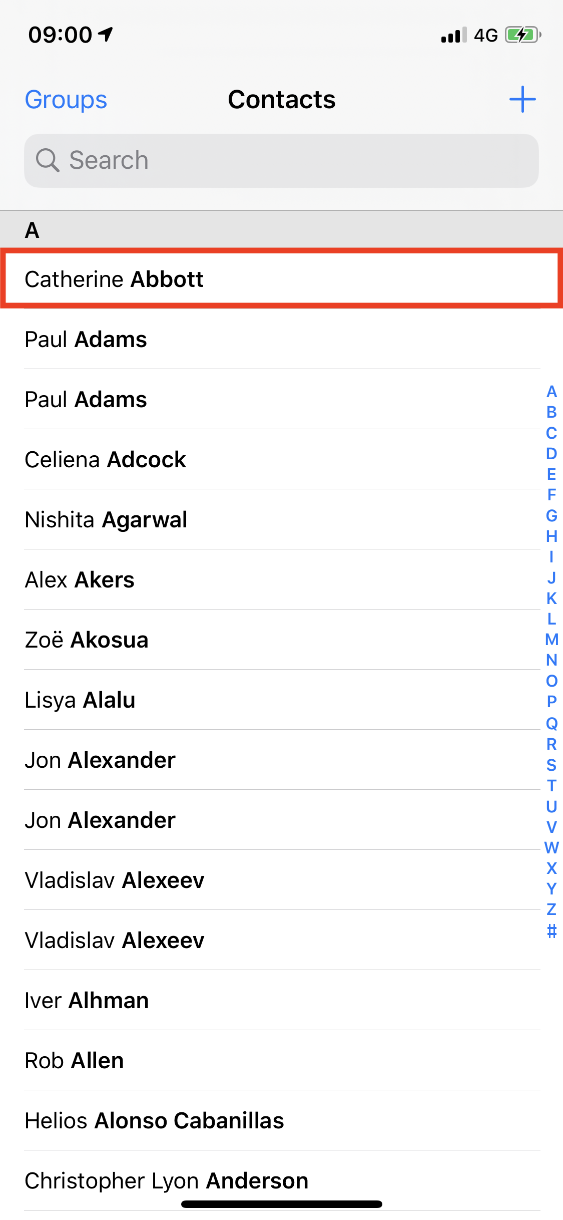
A collection view displays repeated Items. For example, a contact in the Contacts app.
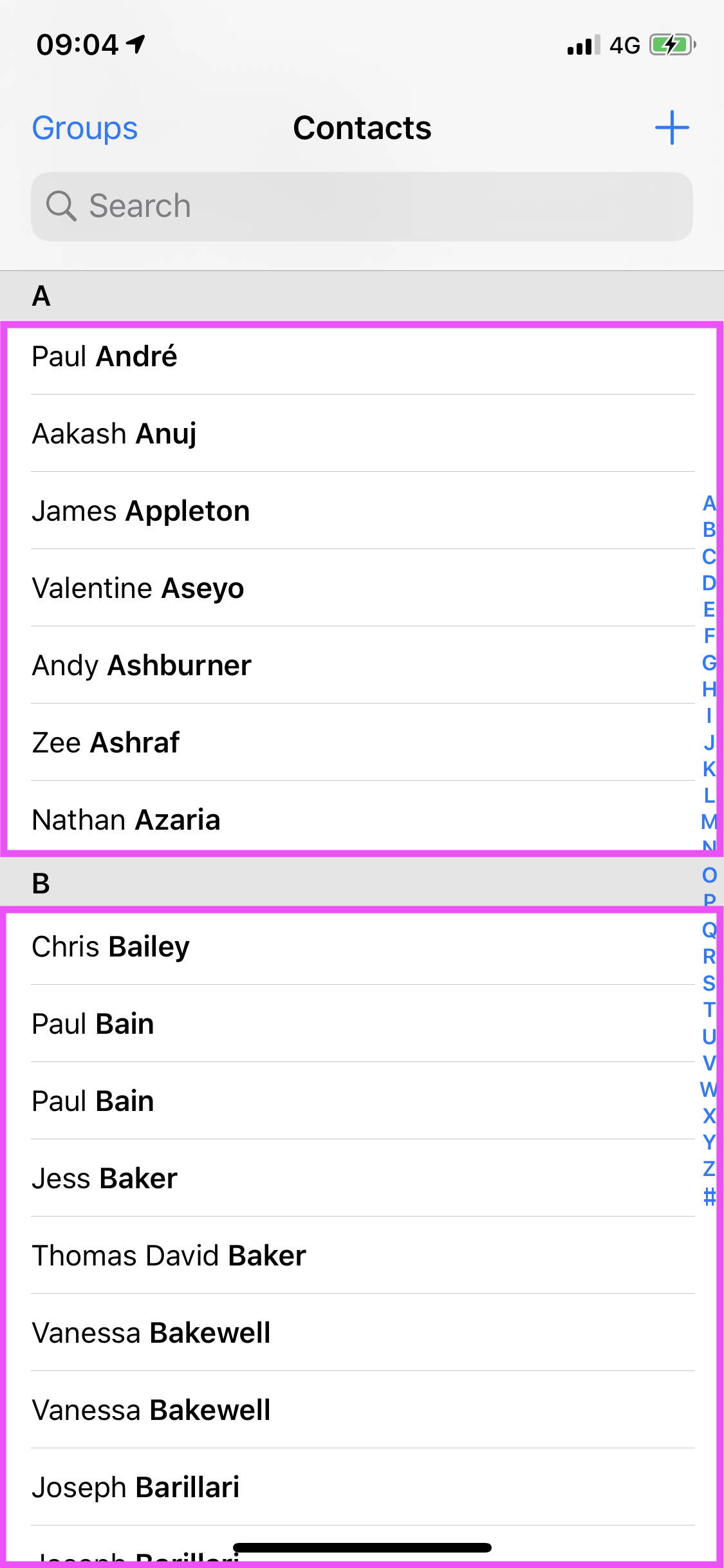
Many apps group Items into Sections, collections of items that logically belong together. In the case of the Contacts app, different sections contain all contacts whose surnames start with the same letter.
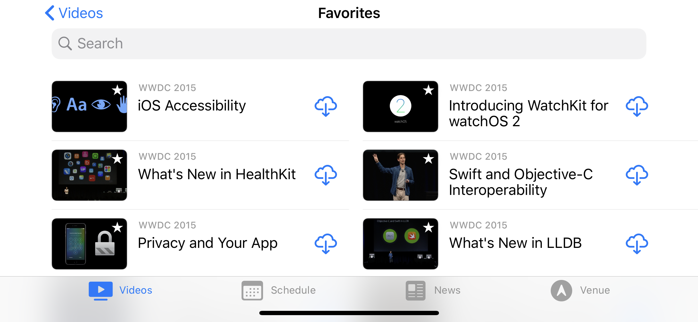
In the Contacts app, that’s as complicated as it gets. But it’s possible to create much more complex layouts. For example, the WWDC videos app uses a two-column layout on wider displays and the Dropbox app uses a three-column layout when viewing files in a folder.
Prior to iOS 13, UIKit shipped with a single layout class: UICollectionViewFlowLayout. Any layout that was beyond the abilities of the built-in flow layout required building a custom layout class, often requiring hundreds of lines of code.
Now, with UICollectionViewCompositionalLayout, Apple has introduced the concept of Groups. This enables much more sophisticated layouts with very minimal amounts of code.
Consider the layout above from the built-in Photos app. At first glance, this looks like a three-column layout. But, on closer inspection, notice how the large image takes the space of four photos from the three-column layout. Clearly, something more sophisticated is going on here, and the answer is Groups!
Groups sit between Items and Sections and allow you to apply different layouts within a section. Neat!
Building Your First Layout
OK, enough with the theory. Time to build a layout!
Open AlbumDetailViewController.swift and navigate to generateLayout(). This method is responsible for generating the instance of UICollectionViewCompositionalLayout that your collection view uses to lay out its items.
Here’s the method as it stands in the starter project:
func generateLayout() -> UICollectionViewLayout {
  //1
  let itemSize = NSCollectionLayoutSize(
    widthDimension: .fractionalWidth(1.0),
    heightDimension: .fractionalHeight(1.0))
  let fullPhotoItem = NSCollectionLayoutItem(layoutSize: itemSize)
  //2
  let groupSize = NSCollectionLayoutSize(
    widthDimension: .fractionalWidth(1.0),
    heightDimension: .fractionalWidth(2/3))
  let group = NSCollectionLayoutGroup.horizontal(
    layoutSize: groupSize,
    subitem: fullPhotoItem,
    count: 1)
  //3
  let section = NSCollectionLayoutSection(group: group)
  let layout = UICollectionViewCompositionalLayout(section: section)
  return layout
}
Here’s what’s happening in the code above:
- The
fullPhotoItemis anNSCollectionLayoutItemwith a fractional width and height of 1, which will mean it will fill the Group that contains it. - Next, create an
NSCollectionLayoutGroupwith a a fractional width of 1 but height 2/3 the width — the standard aspect ratio for a photo. The group contains a single horizontal item. - The final part of the layout is the
NSCollectionLayoutSection, which in this case contains the single group created in the line above.
This matches the layout you see in the app. Each photo is full width and 2/3 of the width high.
But what if you want a two-column layout? Replace the Group layout code as below, updating the height of the Group size and the number of items in the layout Group:
let groupSize = NSCollectionLayoutSize(
  widthDimension: .fractionalWidth(1.0),
  heightDimension: .fractionalWidth(1/3))
let group = NSCollectionLayoutGroup.horizontal(
  layoutSize: groupSize,
  subitem: fullPhotoItem,
  count: 2
)
You have now set the group to half its original height, but made it contain two items. Build and run the project and see how the layout has changed. Easy, huh? :]
This is starting to look better already, but wouldn’t it be nicer if each photo had a space to call its own? UICollectionViewCompositionalLayout has support for this out of the box using content insets. Add the following to generateLayout() after the creation of fullPhotoItem:
fullPhotoItem.contentInsets = NSDirectionalEdgeInsets(
  top: 2,
  leading: 2,
  bottom: 2,
  trailing: 2)
That’s all it takes! Build and run your app.


