Adding a Toggle
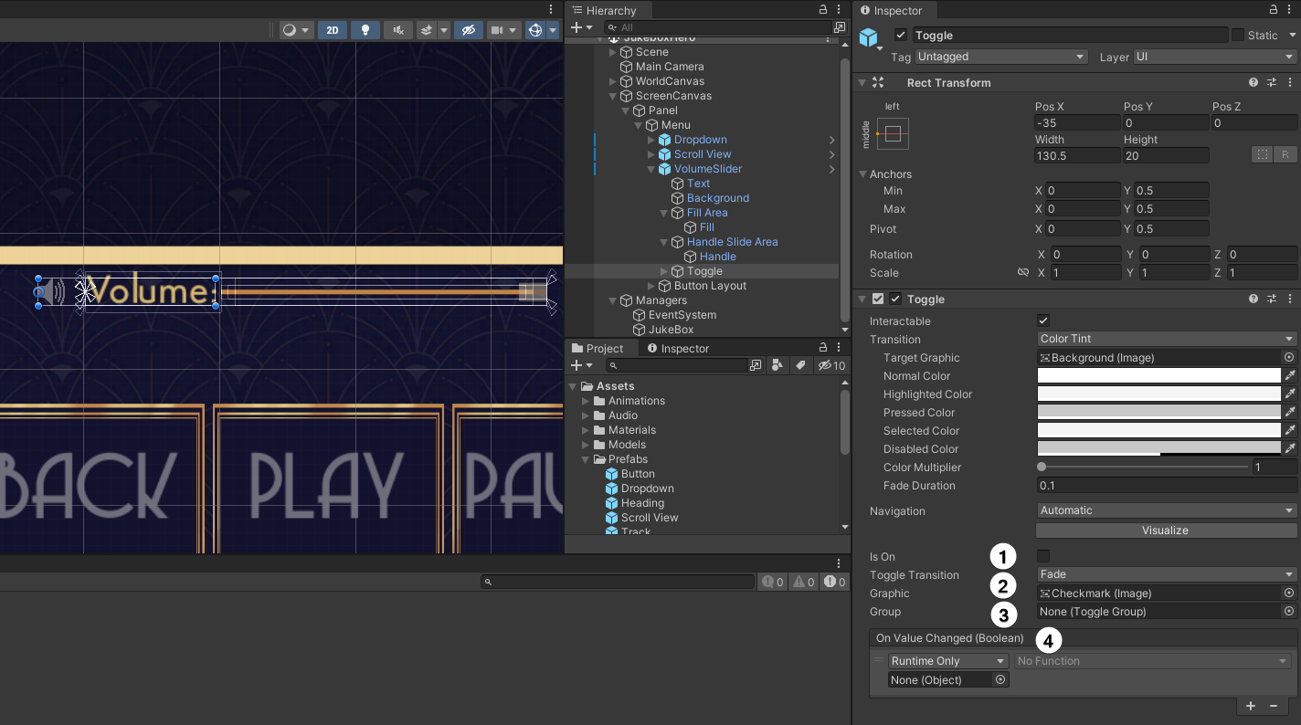
Fortunately, there’s already a Toggle in the scene for you to use. Expand the VolumeSlider GameObject and you’ll see there’s a Toggle underneath it. This was part of the original prefab you added to the scene. The little volume icon was actually a Toggle all along. Select it in the Hierarchy to see the component details.

-
Is On: The current state of the Toggle.
-
Transition & Graphic: The mode that the Graphic will transition, defaults to Fade. And a reference to the checkmark image.
-
Group: If you want to create Radio Buttons, then you need to add a Toggle Group component to an object, and have all the Toggles reference the same group. Only one Toggle can be on in a group.
-
On Value Changed: The trusty event! This time it reports a boolean status — the Is On value.
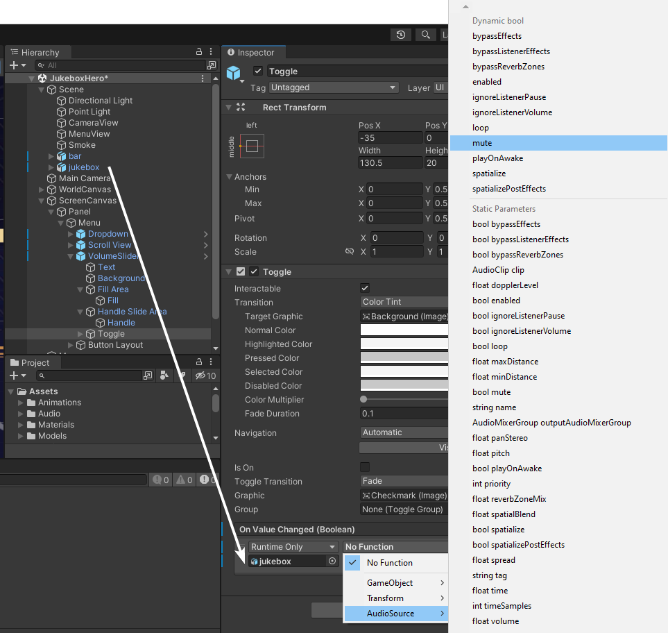
Your final task is to add a listener to the OnValueChanged event. This time, drag the jukebox from Scene / jukebox (the actual 3D jukebox GameObject, not the Manager one) onto the object field and select AudioSource ▸ mute. Again, it’s the Dynamic bool option you want.

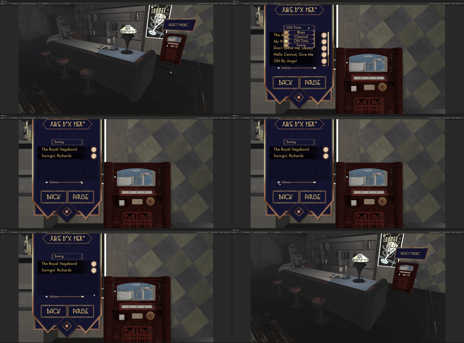
Save the scene one last time and enter Play mode. Get to the menu and try out all the UI and features you’ve added to JukeBox Hero!

Where to Go From Here
Download the completed project files by clicking the Download Materials button at the top or bottom of the tutorial.
You’ve learned all about the different UI components that come standard with Unity. Once you get the hang of these, check out the Unity UI Extensions package. It adds a whole host of new and exciting components for you to use in your projects.
Or, why not design your own components?! Through scripting and the use of the Vertex Helper, you can create completely custom UI components.
We hope you enjoyed this tutorial. If you have any questions or comments, please join the forum discussion below!
