Introduction to Unity UI – Part 1
UI is a crucial part of any video game. Even in the most basic of games you need to navigate a main menu to start the action! In this tutorial, you’ll learn about the most common components developers use to build user interfaces in Unity. All while listening to some sweet sliding blues music. :] By Ben MacKinnon.
Sign up/Sign in
With a free Kodeco account you can download source code, track your progress, bookmark, personalise your learner profile and more!
Create accountAlready a member of Kodeco? Sign in
Sign up/Sign in
With a free Kodeco account you can download source code, track your progress, bookmark, personalise your learner profile and more!
Create accountAlready a member of Kodeco? Sign in
Contents
Introduction to Unity UI – Part 1
25 mins
Building a World UI
For this project, you’re going to build a UI that lets the user change the music playing on the jukebox through a 2D menu. But first, to access the menu, the player will need to click on a button that’s hovering just above the jukebox in the scene. This is where your first canvas will come in.
Back in Unity, select the WorldCanvas you made earlier in the Hierarchy. In the Canvas component, make sure the Render Mode is set to World Space. You’ll see the RectTransform is now no longer grayed out, and the Canvas Scaler is forced to the World scale mode.
World Space UI needs to be accurately placed and sized to where in the 3D scene you want it to be. But, you still want to be able to size your UI components in a way that makes sense. Fortunately, there’s an easy trick to achieve this!
In the RectTransform, you want the width and height to match the reference resolution that you’d put into the Canvas Scaler if this were a 2D UI. Then, you need to work out the physical size of the UI within the scene. Once you know that, set the Scale of the canvas to be physical size / width in all three axes.
Consider this scenario: you want to have name indicators above NPCs in your world. The canvas is 1920 x 1080. Your NPCs are the size of the standard Unity Capsule module, which are 1 unit wide.
To make sure that the width of the canvas matches to world units, take the amount of world units you need (1 in this case) and divide it by the width of pixels in your canvas (1920 in this case). Set that value as the scale on all axes of the Rect Transform. The resulting canvas would have scale of (X:0.0005208334, Y:0.0005208334, Z:0.0005208334). To make the calculation easier, Unity also lets you input simple math equations into value fields, so you would set the scale as (X:1/1920, Y:1/1920, Z:1/1920). :]
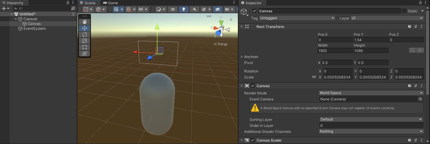
In this scenario, the canvas would sit perfectly above the capsule, ready to be filled with UI elements!
Now, back to your canvas. It’s going to house just a single button, so set the canvas to be the size of that button: 900 x 375 pixels. It’s going to sit above the jukebox in the scene, which you can find under Scene / jukebox in the Hierarchy. If you select it, you’ll see its scale is (X:10, Y:10, Z:10). So, you need to make the Scale of your world canvas 10/900 or 0.01111111.
To position the canvas above the jukebox, set the Position to be (X:-42.25, Y:14.5, Z:-2). You need the Z-axis (blue arrow of the gizmo) to be facing the correct direction in order for the player to see the UI. You can also add a little tilt to it to make it look more interesting in the scene, so set the Rotation to be (X:8, Y:180, Z:-0.3). The final product will look like this:
The only thing left for this World UI is to add a button and hook it up to some premade functionality. Fortunately for you, there’s also a premade button sitting in Assets / Prefabs! Simply drag this out as a child of the WorldCanvas.
Next, click the RectTransform Anchor Presets button (the crosshair-looking box in the top-left of the component). When the dialogue opens, hold down Shift and Alt before clicking on the option in the bottom right. This will stretch the button out so that it fills the entire canvas.
Finally, it’s time to make this button do something! Find the OnClick event on the Button component in the Inspector. Click the + button to add two events. Then, add the following two actions:
- Drag Main Camera to the first slot, and select CameraTween ▸ MoveToMenu from the drop-down.
- Drag WorldCanvas to the second slot, and select GameObject ▸ SetActive from the drop-down. Make sure the checkbox is off.
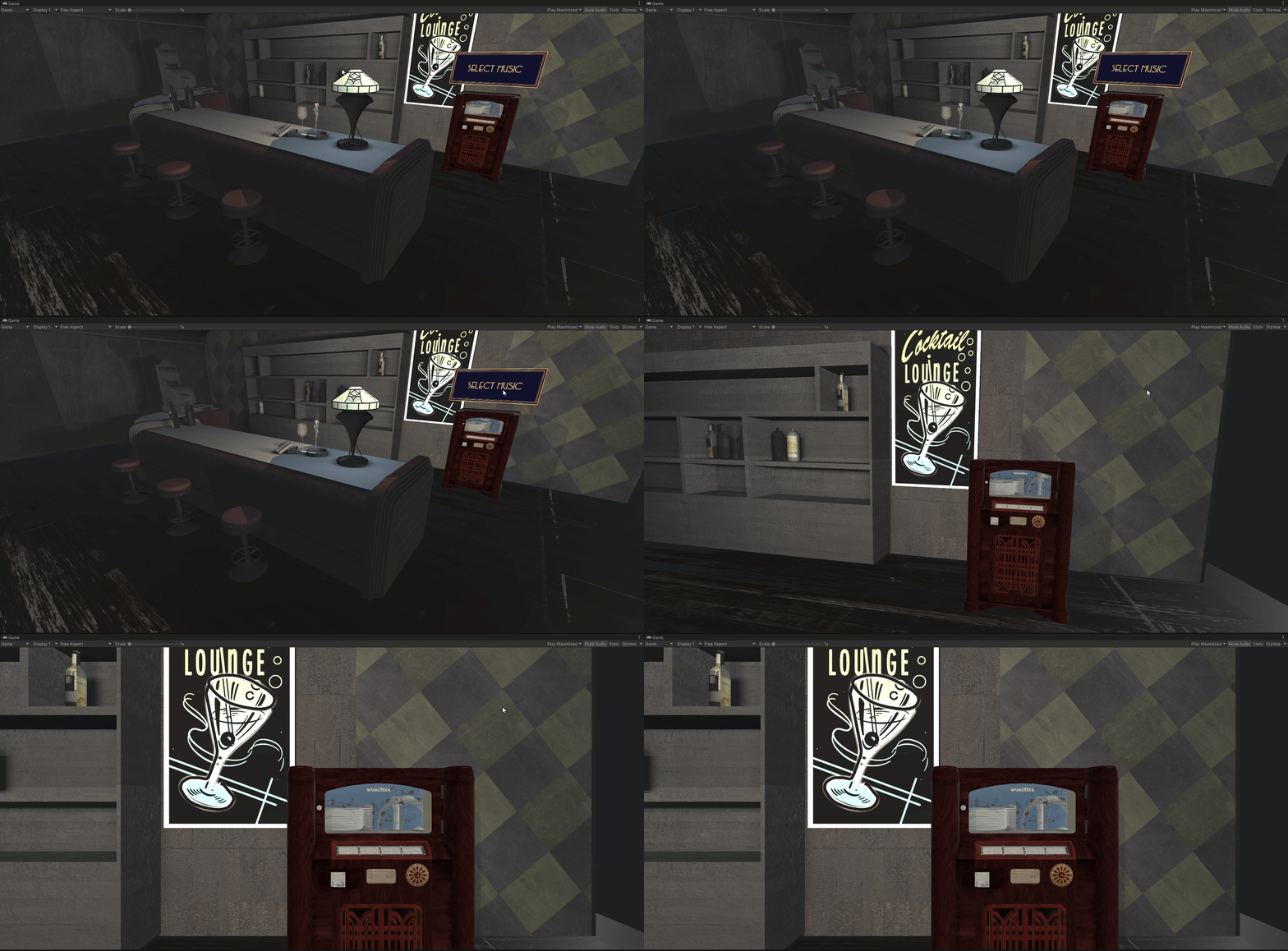
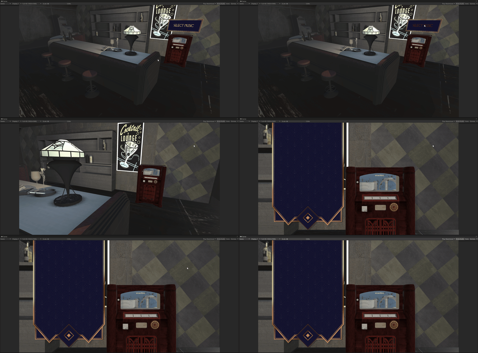
That’s it! You’ve set up your World UI. Save your scene, press Play and click your button in the scene. See how the camera moves over to the jukebox and your button disappears?
Up next, you’ll make a 2D menu appear in its place.
Setting up a Screen Space UI
Create another Canvas by selecting GameObject ▸ UI ▸ Canvas. Name this one ScreenCanvas. Leave the Canvas Render Mode as Screen Space – Overlay this time, but change the UI Scale Mode in the Canvas Scaler to Scale with Screen Size.
Set the Reference Resolution to 1920 x 1080, and move the Match slider all the way to Height, so it the shows the value 1.
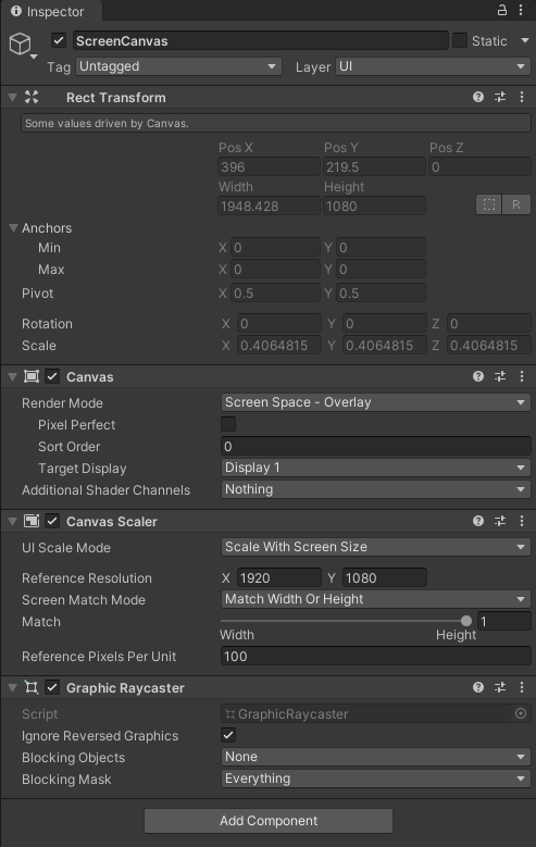
Now that you’ve set the reference resolution for your panel, set the aspect ratio of the Game view camera to the same size. This will make sure all of your UI elements will conform to that aspect ratio as well and won’t change as you resize your game view either intentionally or unintentionally.
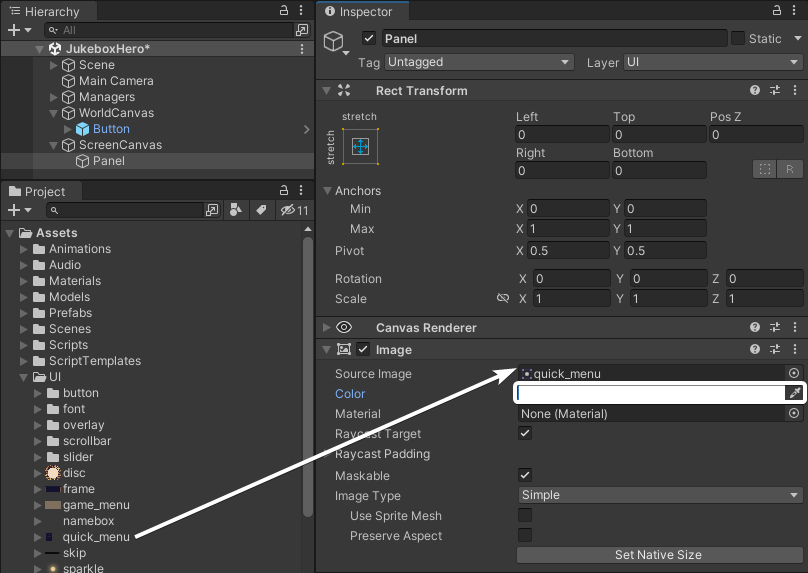
Next, add a Panel as a child to the canvas by right-clicking on ScreenCanvas in the Hierarchy and selecting UI ▸ Panel. By default, a panel stretches to fill the entire canvas. Using Panels is a great way to organize your UI. They also come with an Image component that provides a semitransparent background. Change the image used on this component to Assets / UI / quick_menu, and remove the transparency by setting the Color value to either (R:255, G:Y255, B:255, A:255} (if your color picker is in RGB 0-255) or (R:1, G:1, B:1, A:1) (if your color picker is in RGB 0-1.0).
Jump over to the Game View and you’ll see there’s now a nice menu style panel to the left side of the screen.
There’s just one final thing to set up on the panel. The World Space UI disappears when the camera transitions, so it would be good to have the Screen Space UI only appear once the transition is done. Do the following:
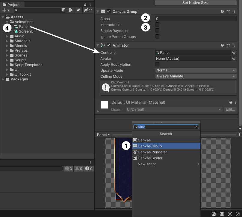
- Add a Canvas Group component to the Panel.
- Set the Alpha to 0.
- Uncheck all the boxes.
- Drag the Panel Animation controller from Assets / Animations onto the Panel. This will add an Animator component automatically, with the controller already attached.
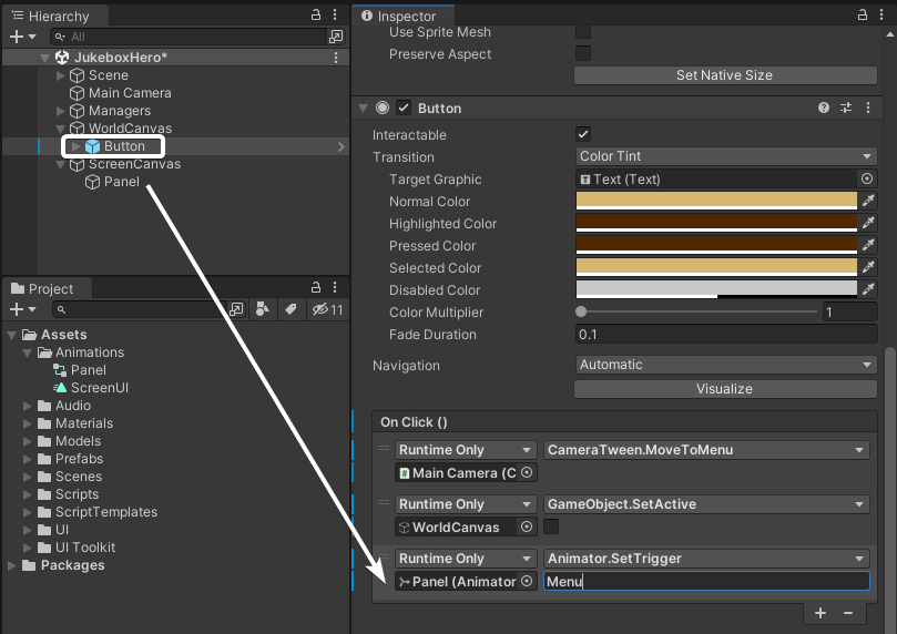
Now go back to the button in the WorldCanvas and add another call to the On Click event. Drag the Panel from the ScreenCanvas into the slot, and select Animator ▸ SetTrigger (string) from the drop-down. Type Menu into the field.
This animator is already set to change the alpha value of the canvas group and toggle the checkboxes back on again. Save the scene and press Play to test it out!
Time to add some functionality to the menu. :]


