An Introduction to Material Design with Kotlin
In this tutorial you’ll learn how to integrate Material Design into an existing app and create delightful interactions using the animation APIs. By Aaqib Hussain.
Sign up/Sign in
With a free Kodeco account you can download source code, track your progress, bookmark, personalise your learner profile and more!
Create accountAlready a member of Kodeco? Sign in
Sign up/Sign in
With a free Kodeco account you can download source code, track your progress, bookmark, personalise your learner profile and more!
Create accountAlready a member of Kodeco? Sign in
Sign up/Sign in
With a free Kodeco account you can download source code, track your progress, bookmark, personalise your learner profile and more!
Create accountAlready a member of Kodeco? Sign in
Contents
An Introduction to Material Design with Kotlin
35 mins
- Getting Started
- Setting Up the Theme
- Using RecyclerView and CardView
- Implementing a Recycler View in XML
- Initializing a Recycler View and Applying a Layout Manager
- Creating Rows and Cells Using a Card View
- Implementing an Adapter for a Recycler View
- Implementing a Click Interface for Each Cell
- From List to Grid and Back
- Using the Palette API in the List
- Using the Material APIs
- Adding a Reveal Animation
- Morphing a Bezier Path for a Floating Action Button
- Adding Dynamic Colors to Views Using Palette API
- Activity Transitions With Shared Elements
- Where to Go From Here?
Adding Dynamic Colors to Views Using Palette API
It’s time to add colors to this view using the Palette API. And not just any colors—as before, they will be dynamic colors!
In DetailActivity, flesh out colorize() by adding the following:
val palette = Palette.from(photo).generate()
applyPalette(palette)
Just like you did previously, you generate a palette from a photo – although this time you do it synchronously – and then pass that palette onto applyPalette(). Replace the existing method stub for applyPalette() with this code:
  private fun applyPalette(palette: Palette) {
    window.setBackgroundDrawable(ColorDrawable(palette.getDarkMutedColor(defaultColor)))
    placeNameHolder.setBackgroundColor(palette.getMutedColor(defaultColor))
    revealView.setBackgroundColor(palette.getLightVibrantColor(defaultColor))
  }
Here you’re using the dark muted color, the muted color, and the light vibrant color as the background colors of the window, title holder, and reveal view respectively.
Finally, to kick-off this chain of events add the following line to the bottom of getPhoto():
colorize(photo)
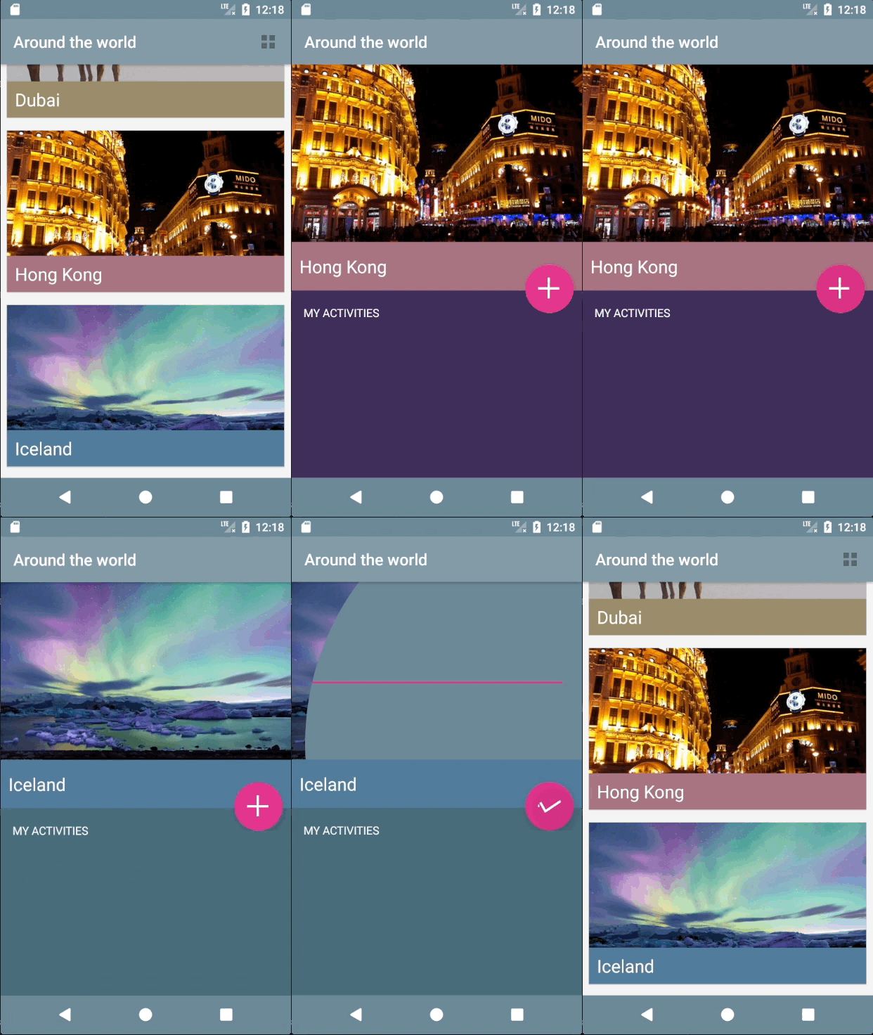
It’s that time again… build and run your app! You can see the detail activity is now using a color scheme derived from the palette of the associated image.
Activity Transitions With Shared Elements
We’ve all seen and wondered about those nice image and text transitions in Google’s app which has been updated to use Material Design. Well, wait no more—you’re about to learn the intricacies of achieving a smooth animation.
Between the places list view, MainActivity, and the places detail view, DetailActivity, you’re going to transition the following elements:
- The image of the place;
- The title of the place;
- The background area of the title.
Open row_places.xml and add the following to the declaration of the ImageView tag with an id of placeImage:
android:transitionName="tImage"
And then add this to the LinearLayout tag with an id of placeNameHolder:
android:transitionName="tNameHolder"
Notice that placeName doesn’t have a transition name. This is because it is the child of placeNameHolder, which will transition all of its child views.
In activity_detail.xml, add a transitionName to the ImageView tag with the id placeImage:
android:transitionName="tImage"
And, in a similar fashion, add a transitionName to the LinearLayout tag that has an id of placeNameHolder:
android:transitionName="tNameHolder"
Shared elements between activities that you want to transition should have the same android:transitionName, which is what you’re setting up here. Also, notice that the size of the image, as well as the height of the placeNameHolder, are much larger in this activity. You’re going to animate all of these layout changes during the activity transition to provide some nice visual continuity.
In onItemClickListener() found in MainActivity, update the method to the following:
override fun onItemClick(view: View, position: Int) {
  val intent = DetailActivity.newIntent(this@MainActivity, position)

  // 1
  val placeImage = view.findViewById<ImageView>(R.id.placeImage)
  val placeNameHolder = view.findViewById<LinearLayout>(R.id.placeNameHolder)

  // 2
  val imagePair = Pair.create(placeImage as View, "tImage")
  val holderPair = Pair.create(placeNameHolder as View, "tNameHolder")

  // 3
  val options = ActivityOptionsCompat.makeSceneTransitionAnimation(this@MainActivity,
    imagePair, holderPair)
  ActivityCompat.startActivity(this@MainActivity, intent, options.toBundle())
}
After adding this code, you will need to manually add the following import statement to the top of the file as Android Studio cannot automatically determine that this is the intended package.
import android.support.v4.util.Pair
There are a couple of things to highlight here:
- You get an instance of both
placeImageandplaceNameHolderfor the given position of theRecyclerView. You’re not relying on Kotlin Android Extensions here since you need theplaceImageandplaceNameHolderfrom the specificview. - You create a
Paircontaining the view and thetransitionNamefor both the image and the text holder view. Note that you will once again have to manually add the import statement to the top of the file:android.support.v4.util.Pair. - To make the activity scene transition with shared views, you pass in your
Pairinstances and start the activity with youroptionsbundle.
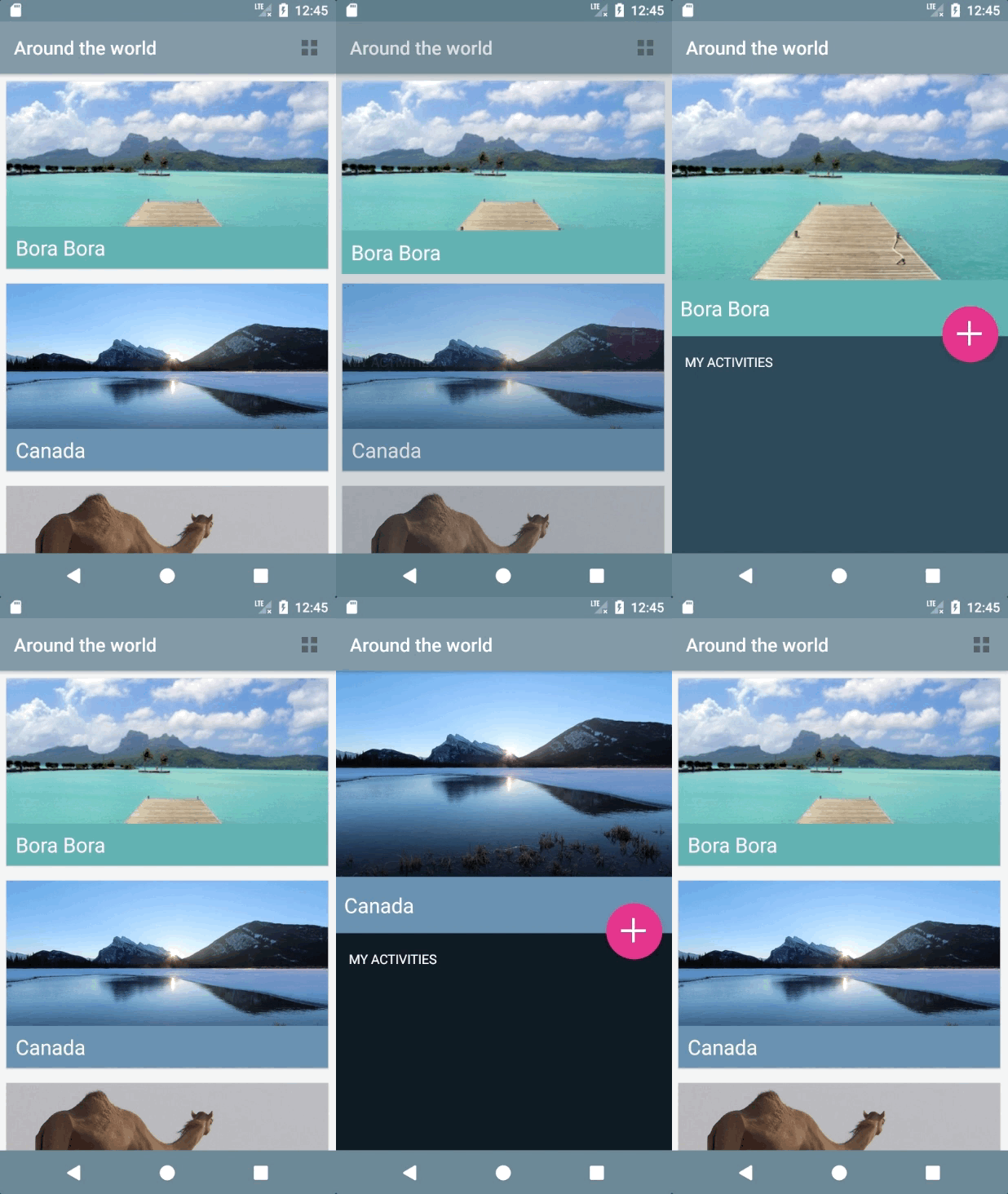
Build and run to see the image transition from the main activity to the detail activity:
However, the animation is a bit jumpy in two areas:
- The FAB button suddenly appears in
DetailActivity. - If you tap on a row under the action or navigation bar, that row appears to jump a bit before it transitions.
You’ll solve the FAB button issue first. Open DetailActivity.kt and add the following to windowTransition():
window.enterTransition.addListener(object : Transition.TransitionListener {
  override fun onTransitionEnd(transition: Transition) {
    addButton.animate().alpha(1.0f)
    window.enterTransition.removeListener(this)
  }

  override fun onTransitionResume(transition: Transition) { }
  override fun onTransitionPause(transition: Transition) { }
  override fun onTransitionCancel(transition: Transition) { }
  override fun onTransitionStart(transition: Transition) { }
})
The listener you add to the enter transition is triggered when the window transition ends, which you use to fade in the FAB button. For this to be effective, set the alpha to 0 for the FAB in activity_detail.xml:
android:alpha="0.0"
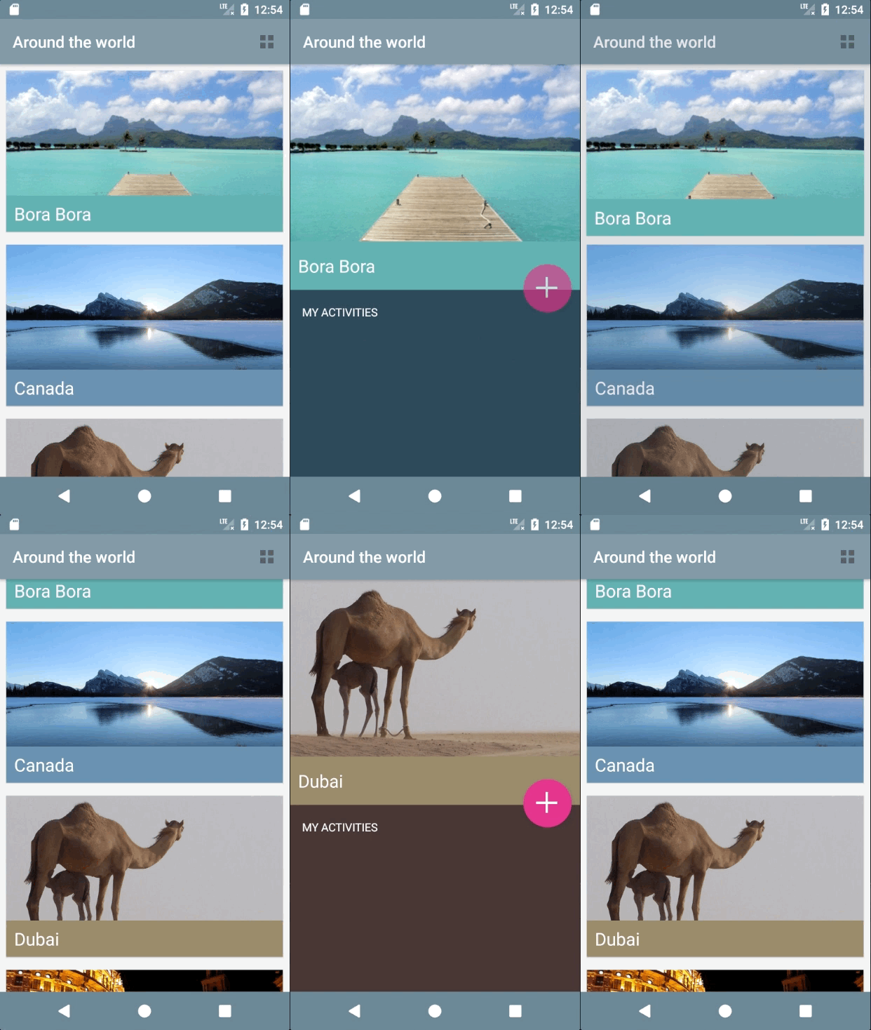
Build and run! You’ll notice the FAB transition is much smoother!:
As for the action bar and navigation bar issues, begin by updating styles.xml, to set the parent theme to Theme.AppCompat.Light.NoActionBar:
<style name="AppTheme" parent="Theme.AppCompat.Light.NoActionBar">
Since there is no action bar defined in styles.xml, you’ll have to add it using individual XML views.
Open activity_main.xml and add the following inside LinearLayout, just above the RecyclerView tag:
<include layout="@layout/toolbar" />
This simply includes a toolbar layout that's provided as part of the starter project into the current layout. Now you need to make a similar change to the detail activity's layout.
Open activity_detail.xml and add the following at the very bottom of the first FrameLayout, just below the closing tag of the inner LinearLayout:
<include layout="@layout/toolbar_detail"/>
Next in MainActivity, you need to initialize the toolbar. Add the following to the bottom of the onCreate() method:
setUpActionBar()
Here you assign the result of the findViewById call to the new field, and then call setUpActionBar(). At the moment it's just an empty method stub. Fix that now by adding the following to setUpActionBar():
    setSupportActionBar(toolbar)
    supportActionBar?.setDisplayHomeAsUpEnabled(false)
    supportActionBar?.setDisplayShowTitleEnabled(true)
    supportActionBar?.elevation = 7.0f
Here you set the action bar to be an instance of your custom toolbar, set the visibility of the title, disable the home button, and add a subtle drop shadow by setting the elevation.
Build and run. You'll notice that nothing much has changed, but these changes have laid the foundations of properly being able to transition the toolbar.
Open MainActivity and replace the existing onItemClickListener with this one:
private val onItemClickListener = object : TravelListAdapter.OnItemClickListener {
  override fun onItemClick(view: View, position: Int) {
    // 1
    val transitionIntent = DetailActivity.newIntent(this@MainActivity, position)
    val placeImage = view.findViewById<ImageView>(R.id.placeImage)
    val placeNameHolder = view.findViewById<LinearLayout>(R.id.placeNameHolder)

    // 2
    val navigationBar = findViewById<View>(android.R.id.navigationBarBackground)
    val statusBar = findViewById<View>(android.R.id.statusBarBackground)

    val imagePair = Pair.create(placeImage as View, "tImage")
    val holderPair = Pair.create(placeNameHolder as View, "tNameHolder")

    // 3
    val navPair = Pair.create(navigationBar, Window.NAVIGATION_BAR_BACKGROUND_TRANSITION_NAME)
    val statusPair = Pair.create(statusBar, Window.STATUS_BAR_BACKGROUND_TRANSITION_NAME)
    val toolbarPair = Pair.create(toolbar as View, "tActionBar")

    // 4
    val pairs = mutableListOf(imagePair, holderPair, statusPair, toolbarPair)
    if (navigationBar != null && navPair != null) {
      pairs += navPair
    }

    // 5
    val options = ActivityOptionsCompat.makeSceneTransitionAnimation(this@MainActivity,
      *pairs.toTypedArray())
    ActivityCompat.startActivity(this@MainActivity, transitionIntent, options.toBundle())
  }
}
The differences between the original implementation and this one are thus:
- You've renamed the intent to provide more context;
- You get references to both the navigation bar and status bar;
- You've created three new instances of
Pair- one for the navigation bar, one for the status bar, and one for the toolbar; - You've protected against an IllegalArgumentException that occurs on certain devices, such as the Galaxy Tab S2, on which
navPairis null. - And finally you've updated the options that are passed to the new activity to include the references to the new views. You've used the Kotlin spread operator
*onpairs, after changing it to a typed array.
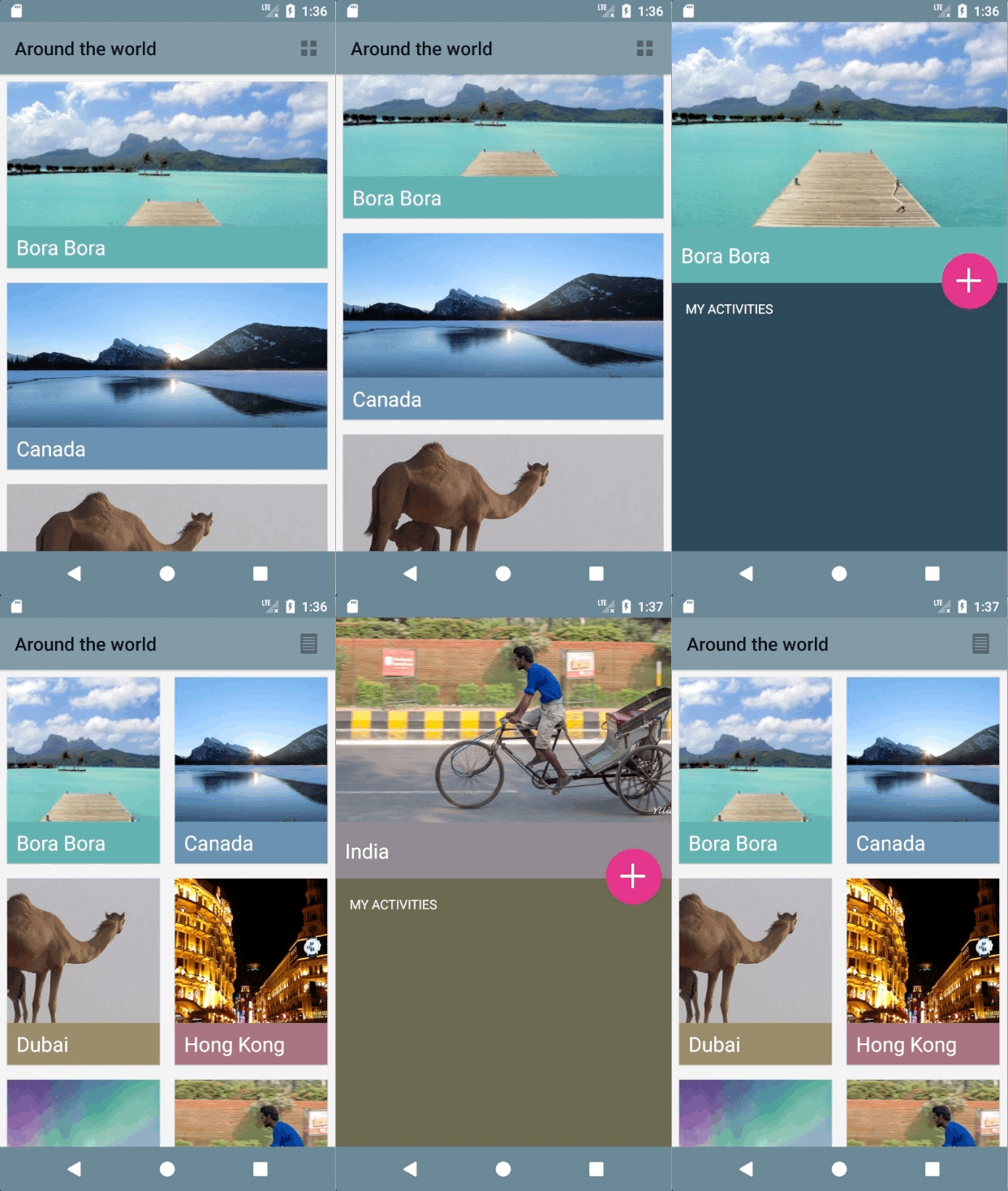
Great! Build and run, and you’ll see a much smoother animation:
Now if you tap on a row under the action/toolbar or navigation bar, it doesn't jump before the transition; it transitions with the rest of the shared elements, which is much more pleasing to the eye. Switch to the grid view and you'll notice that the transitions work very nicely with that layout as well.
Ta-da! Here is a video of the final app in action:


